0 members and 4,748 guests
No Members online

» Site Navigation

» Stats
Members: 35,443
Threads: 103,072
Posts: 826,684
Top Poster: cc.RadillacVIII (7,429)
|
-
 Halo Collaboration - Tay & Rad Halo Collaboration - Tay & Rad
I believe this is the forth collab between myself and Tay X.
He started it out, I finished it off. Nice working with you again m8 
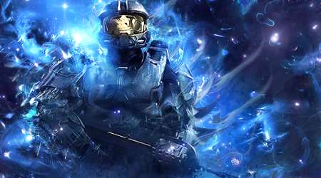
CnC are more than welcome!
-
I love the turn out :P and ounce again i loved working with you
-
Great , I must say. a bit too busy for me and needs more depth. Kiu guys!
Dare the Devil

www.artistic8.com
-Domino-
-
i like it alot  colours, lights , all! colours, lights , all!
tho the focal looks bit messy i must say, maybe clear it off a bit,try add bit more depth,
maybe text cuz other ways it looks bit unfinished in right side :P
other then that, i love it!
-
I am loving this. Great sig. There are just two things I don't really love, the first is that the only yellow is in the visor, so it feels out of place, if there was some other yellow accents it would add a lot of dimension to it IMO, or just make the yellow blue or white or purple or something that blends well with the other colors in the sig. Also, the right side feels a little lonely to me.
I don't think that this sig is too busy at all, it has AMAZING blending and effects used on it, which I LOVE. I just think the right side could use some more tweaking, either more effects, or more depth or something on that part. Perhaps expand the brighter blue over to the right and blend it in, you can't really add something large there because it wouldn't make much sense, so I get that. I was thinking some c4d work or maybe some technological / wire / circutry BG work done to make it mesh more, like some structures hiding just behind the blue or something, or use some cool burn effects like a cigarette burn in a photo or something, just a little something to offset the balance without taking away from the focal you know?
VERY nice piece though 9/10. Keep it up, GREAT colab!!
-
thats a cool collab may i sugest maybe adding in some of that gold color in the the streaks of the effects maybe ? to keep the flow and colors of the render gj tho kiu
-
You both suck ass =p
Nice turn out guys. KIU ^^
-
Thanks for that beast comment and rating TZP.
Yeah to accomplish some kind of depth was the hardest part with this sig. I didn't want to add to much to the bg. Infact there is a wire frame there, just at a very low opacity.
The orange glow on his helm was added to break up the otherwise blue color scheme, and make his head pop out to give him the main focus ^u^
I tried some text but it didn't work out this time.
Didn't want to add to much other colors on the effects tho it might've gotten out of hand and just mess up the compo instead.
Thank you all for the lovely comments!
Last edited by cc.RadillacVIII; 01-07-2011 at 04:38 AM.
Similar Threads
-
By cc.RadillacVIII in forum Sigs & Manips
Replies: 10
Last Post: 10-25-2010, 04:49 AM
-
By NXWxWolves in forum Sigs & Manips
Replies: 3
Last Post: 08-14-2010, 12:53 AM
-
By ~FireTap in forum Digital Art
Replies: 1
Last Post: 07-07-2005, 05:33 PM
-
By Antagonist in forum Digital Art
Replies: 11
Last Post: 06-18-2005, 09:31 AM
 Posting Permissions
- You may not post new threads
- You may not post replies
- You may not post attachments
- You may not edit your posts
-
Forum Rules
|


 Reply With Quote


