0 members and 5,653 guests
No Members online

» Site Navigation

» Stats
Members: 35,443
Threads: 103,072
Posts: 826,684
Top Poster: cc.RadillacVIII (7,429)
|
-
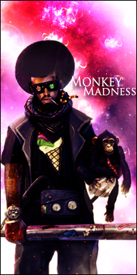
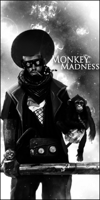
 Vocaloid & Monkey Man Vocaloid & Monkey Man
Im a beginner sort of at photoshop but these are my favorite pieces i made.

-
The first piece is amazing, the only thing I would change is the font, maybe enlarge it and bold it and make it a clipping mask so it blends in more.
The second piece has great colors (I don't much like B&W personally) but it doesn't seem really blended into the BG to me. You could use a wide array of effects to make it mesh more, maybe some splatter or even smudge on some parts, such as the legs, and maybe a shoulder, to give it that added depth and some flow as well.
Very good pieces though, keep up the great work.
Oh, also, the bottom right corner seems too whitewashed to me, maybe add a little color there to help with the flow as well. I like how crisp the sword and glasses and face / monkey are. Very nice.
-
Not quite familiar with the clipping mask but is this what you meant?

-
Yeah something like that looks a lot better. I think take off the drop shadow and you have a winner. 
I JUST started using clipping masks and I'm addicted to them now lol so that's why I've been talking about them constantly.
-
Without the dropshadow you cant see the text at all.
-
anyone else have any advice on how i can improve these pieces?
-
ive always loved your work, i agree with tzp on the blending of the second piece it seems to stand out a little too much
Similar Threads
-
By Xelo in forum Sigs & Manips
Replies: 5
Last Post: 12-08-2010, 12:00 PM
-
By MrInsane in forum Sigs & Manips
Replies: 3
Last Post: 04-01-2010, 12:28 PM
-
By Renz in forum Sigs & Manips
Replies: 9
Last Post: 03-11-2010, 10:55 PM
-
By Nutter in forum Sigs & Manips
Replies: 8
Last Post: 08-22-2009, 07:15 PM
 Posting Permissions
- You may not post new threads
- You may not post replies
- You may not post attachments
- You may not edit your posts
-
Forum Rules
|


 Reply With Quote


