0 members and 503 guests
No Members online

» Site Navigation

» Stats
Members: 35,443
Threads: 103,072
Posts: 826,684
Top Poster: cc.RadillacVIII (7,429)
|
-
 KS Battle SCRAP KS Battle SCRAP


Werent chosen for the battle. CnC anyways
-
the kid cudi one is a pretty much an idea rip from Morphine.
it's great to get inspiration, but it looks almost identical.
i like the first piece, but your execution is off.
try some vectoring + fractals here, it'll really suit the anime.
keep it up!
-
^
Thanks.
I used other presets on the smudge, so its not a rip. 
I did vectoring on the background. Didnt continue on the whole tag, I suck at vectoring.
-
no, no i didn't mean rip like you stole it from him.
i meant it like, it looks similiar.
you should try continuing it, bruh.
-
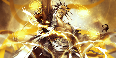
The top one is perfect IMO and I love it because it's so well done and no one uses him, he's one of my fave bleach chars and it's a great render, LOVE the colors as well.
The kid cudi ones are just very unfinished IMO especially compared to the first one.
Keep it up!!
-
top one has got some great colour to play with , bravo.
The Kid ones feel off in there fractals/c4d
If they feel to bright for you heres a tip,
Place your effect in first than put it on screen but lower the opacity, than dup up the image than put it on the linear dodge or colour dodge or w/e you have it on an raise the opacity just before it starts to look over contrasted
The second kid has got some good back light, well done on that as well, gives it grea depth. 
KIU EJ <3
 Radi's one of a kind gift <3
 ^My Wish List^

Similar Threads
-
By Darkie in forum Sigs & Manips
Replies: 8
Last Post: 08-13-2007, 05:41 AM
-
By Bill-Kill in forum Sigs & Manips
Replies: 0
Last Post: 07-11-2007, 08:00 PM
-
By Ben in forum Battlegrounds
Replies: 9
Last Post: 10-31-2005, 12:02 PM
-
By Slim in forum Digital Art
Replies: 4
Last Post: 08-08-2005, 03:59 PM
 Posting Permissions
- You may not post new threads
- You may not post replies
- You may not post attachments
- You may not edit your posts
-
Forum Rules
|


 Reply With Quote


