0 members and 3,474 guests
No Members online

» Site Navigation

» Stats
Members: 35,443
Threads: 103,072
Posts: 826,684
Top Poster: cc.RadillacVIII (7,429)
|
-
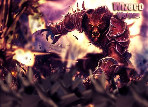
 CnC and stuff please CnC and stuff please
-
very good..add some awesome text and it would be even more awesome.
kiu
-
it's quite nice and i'm really feeling your color scheme here, but your focal point has a bit too much contrast.
work on your lighting, try to make it stronger and coming out from the top right corner.
good work, one of your bests. keep it up !
-
Yeah I agree, play with the colors a bit, looks a little bit too contasty compared to the BG, but VERY good. I like the shade/color of the yellow but for some reason it's a bit distracting. I like that it's simple, so I would keep it that way but it lacks that final tweaking for flow and blending of color, not shape or effect. Keep it up, a very nice sig!
-
Joey gave a good c&c here imo, the colours are just jawsome love the power behind it, you did good showing off the red infront of his body and the blue wrapping around his back.
I kill contrast too all the time 
KIU Cookies <3
 Radi's one of a kind gift <3
 ^My Wish List^

-
i love the smudgework you did. looks awsum! the colorscheme is not good for me. i would have tried to make it more equal, but that's just me ok.
the lightning is good as it is and should not come from the left top (Joey), cause that's where the shades on the render are.
part from the colors i really like this!!
From scratch, just smudging the XL way
Similar Threads
-
By modafokka in forum Digital Art
Replies: 7
Last Post: 06-22-2007, 04:27 PM
-
By soulpower works in forum Digital Art
Replies: 5
Last Post: 03-21-2006, 07:56 AM
-
By Creatix in forum Digital Art
Replies: 3
Last Post: 03-15-2006, 12:21 PM
-
By soundcheck in forum Digital Art
Replies: 3
Last Post: 02-22-2006, 11:27 AM
-
By Jaik in forum Digital Art
Replies: 5
Last Post: 02-19-2006, 11:10 PM
 Posting Permissions
- You may not post new threads
- You may not post replies
- You may not post attachments
- You may not edit your posts
-
Forum Rules
|


 thanks silent_assasin
 Reply With Quote