0 members and 3,323 guests
No Members online

» Site Navigation

» Stats

Members: 35,443
Threads: 103,072
Posts: 826,684
Top Poster: cc.RadillacVIII (7,429)
|
-
 Sith Lord Sith Lord
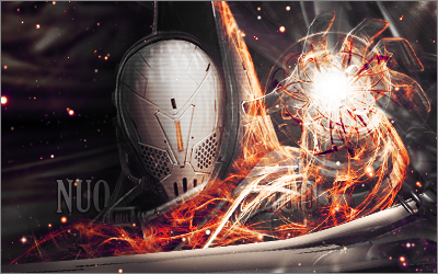
Just for fun, I made this with only the render, two C4Ds, and a space stock. CnC please!
I made the render from this image:
http://www.swtor.com/info/holonet/bi...es/darth-jadus

V2:
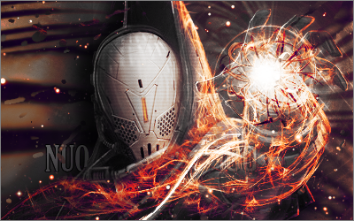
V3:

Last edited by JimNibbles; 01-10-2011 at 02:20 AM.
-
-

 Originally Posted by Wiseco98

gj kiu

anyways, as for the piece. i quite like it, but you should work on your lighting.
the concept of the lighting is nice, but it should be brighter and more appealing.
try adding some more color to the lighting as well, it's basically all white.
the text could go as well.
the effects you've added have a lot of contrast, lower that down a bit.
try filling up your canvas more, work on your lighting + effects and bring out your focal more.
keep it up!
-

Just feel like I have to say that the challenge isn't to use the least amount of resources, but to make the make an optimal signature.
-

Ilike what you did with what you had.
On a side note..anyone here planing on playing SWTOR?
-

nice work not crazy about your text placement try not to place text in your render unless it blends in and works well and your lighting does need to be more in depth with this sig k.i.u.

Genisphere - TRUeLM - VaN ZeBeN 1st Place Team Battle Collab
Gifts
-

Thanks for the cnc guys! I added a V2 and V3 to the OP after making some changes (major and minor).
Last edited by JimNibbles; 01-10-2011 at 02:21 AM.
-
-

v3 is sexy love the flow the depth the blend of c4ds and your text looks much better great job.

Genisphere - TRUeLM - VaN ZeBeN 1st Place Team Battle Collab

Gifts
-

The text on V3 and V2 is way better than V1 and I love the dimmer background fits better than V2.
Overall very nice. I love it.
Similar Threads
-
By Dron in forum Sigs & Manips
Replies: 5
Last Post: 03-15-2010, 06:40 PM
-
Replies: 33
Last Post: 10-23-2008, 07:25 PM
-
By Ryuji Drummer in forum Digital Art
Replies: 0
Last Post: 10-09-2007, 08:47 AM
-
By I.Kazuma in forum Sigs & Manips
Replies: 3
Last Post: 07-24-2005, 02:57 PM
-
By Proflax in forum Resources
Replies: 7
Last Post: 06-02-2005, 10:08 PM
 Posting Permissions
- You may not post new threads
- You may not post replies
- You may not post attachments
- You may not edit your posts
-
Forum Rules
|
