0 members and 603 guests
No Members online

» Site Navigation

» Stats
Members: 35,443
Threads: 103,072
Posts: 826,684
Top Poster: cc.RadillacVIII (7,429)
|
-
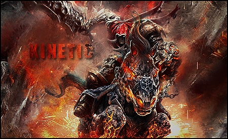
 Darksiders sig CnC Please Darksiders sig CnC Please
So yeah CnC please!

-
Render looks a little HQ..
The BG it is in is very very very good, ideal blending.
Text was very appealing, good use of drop shadow, increases depth.
Do you mind if you go back and do this:
New layer> Image> Apply Image> Filter> Sharpen.
I would like to see the outcome, thanks!
-
ya sure. will post in a sec
Last edited by Kinetics; 01-13-2011 at 06:29 PM.
-
 Originally Posted by Kinetics

ya sure. will post in a sec
Thanks buddy, you can see the sharpening makes it look better and more focussed.
-
i like the sharpened one xD the background is dirty xD i like that too.
Skype: NovruzeliHuseynov

^ LOVE YOU RAD ^
-
First one is better...
A focal that doesn't stand out isn't good, but an oversharpened one isn't good either.
In this case you sharpened the whole sig, which you don't want to do.
To make a focal stand out I do a gaussian blur on an applied image layer (shift+ctrl+alt+e), erase the focal and adjust the opacity. Then I use the unsharp mask filter and/or high pass filter on another applied layer and erase everything but the focal and adjust the opacity.
I didn't think your focal in the first sig looked bad honestly, I just didn't want you to start oversharpening stuff.
The flow is rather chaotic. The sparks underneath are flowing outwards, but on the left of the sig, your effects are flowing inward toward your focal. You should try and give your sig unified motion. The text also looks oversaturated compared to the rest of the tag, it's distracting from the focal...To make it less distracting you could try to blend it in with the rest of your effects, and maybe lower the opacity of the text, or just make it a lighter orange in general and remove the drop shadow.
You could also try experimenting with some gradient maps or other adjustment layers to help the colours in your tag blend together more.
Just some suggestions, hope they help a little. ><
-
Originally Posted by Hoshiko
First one is better...
A focal that doesn't stand out isn't good, but an oversharpened one isn't good either.
In this case you sharpened the whole sig, which you don't want to do.
To make a focal stand out I do a gaussian blur on an applied image layer (shift+ctrl+alt+e), erase the focal and adjust the opacity. Then I use the unsharp mask filter and/or high pass filter on another applied layer and erase everything but the focal and adjust the opacity.
I didn't think your focal in the first sig looked bad honestly, I just didn't want you to start oversharpening stuff.
The flow is rather chaotic. The sparks underneath are flowing outwards, but on the left of the sig, your effects are flowing inward toward your focal. You should try and give your sig unified motion. The text also looks oversaturated compared to the rest of the tag, it's distracting from the focal...To make it less distracting you could try to blend it in with the rest of your effects, and maybe lower the opacity of the text, or just make it a lighter orange in general and remove the drop shadow.
You could also try experimenting with some gradient maps or other adjustment layers to help the colours in your tag blend together more.
Just some suggestions, hope they help a little. ><
. . .Where have you been in my sig making career with CnC as in depth as this, when i was a noob, i would be amazing right now. And personally i didnt like the sharpened one either, i agree with you saying it was over sharpened. I have no idea what a mask or high pass filter is, and what show is your avatar from?
Similar Threads
-
By Shizo in forum Sigs & Manips
Replies: 12
Last Post: 08-30-2010, 05:22 AM
-
By Svoloch in forum Sigs & Manips
Replies: 2
Last Post: 02-24-2010, 11:24 PM
-
By cC.Dispeller in forum Sigs & Manips
Replies: 2
Last Post: 01-11-2010, 05:21 PM
-
By cs4pro in forum Sigs & Manips
Replies: 6
Last Post: 01-09-2010, 02:01 PM
-
By Xelo in forum Sigs & Manips
Replies: 2
Last Post: 12-24-2009, 06:16 PM
 Posting Permissions
- You may not post new threads
- You may not post replies
- You may not post attachments
- You may not edit your posts
-
Forum Rules
|


 Reply With Quote


 Thanks JDragon <3