0 members and 8,759 guests
No Members online

» Site Navigation

» Stats
Members: 35,443
Threads: 103,072
Posts: 826,684
Top Poster: cc.RadillacVIII (7,429)
|
-
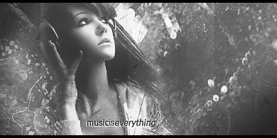
 3 new sigs, Smoke it, Formation Cloud, Exiled warrior. 3 new sigs, Smoke it, Formation Cloud, Exiled warrior.


Well as all of you know, I don't do this everyday...
Though thought to show ya all  , I rarely do though here , I rarely do though here  . .
I named the first, Smoke-alicious, 2nd Formation Cloud, 3rd Exiled warrior.
all random haha.
-
Really dig the 1st minus the text.
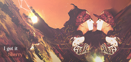
The second seems a lil oversmudged. Maybe bring the focal more right. And again work on text.
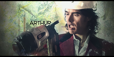
The third would be a lot better if there wasnt C4D all over the focal, but I like the text in it.
-
Yeah thanks, I don't got a lot of fonts.
lol I suck at fonts part, hard ! XD
Could you recommend me some fonts? I will work on the stuff you mentioned. 
Ah I will reduce also the red noise I created.
Last edited by sherry+; 01-13-2011 at 11:24 PM.
-
Well dafont.com has a ton of good fonts.
Arial is always a favorite of mine
I like the font in the 2nd i feel like the placements off. Maybe try moving the text next to the focal and rotate it slightly
-
I agree, the first is my favorite, but the depth is just all wrong, seems like the the c4dhas a clearer focal then the render. Minus the text its a great piece.
Second one there is too much empty space, no depth, and you need to work on your text.
-
first and the last have GREAT effects. all three need text work. the middle one has to much negative space.
over all, much improvement, nice work
Similar Threads
-
By XVIII in forum Sigs & Manips
Replies: 3
Last Post: 01-03-2011, 07:25 AM
-
By cC.ShorterGFX in forum Sigs & Manips
Replies: 9
Last Post: 02-28-2010, 05:53 PM
-
By zole in forum Sigs & Manips
Replies: 7
Last Post: 04-05-2009, 06:53 AM
-
By Lew in forum Sigs & Manips
Replies: 10
Last Post: 10-18-2008, 09:45 PM
-
By KingSmall in forum Digital Art
Replies: 17
Last Post: 04-26-2005, 12:35 AM
 Posting Permissions
- You may not post new threads
- You may not post replies
- You may not post attachments
- You may not edit your posts
-
Forum Rules
|


 Reply With Quote