GFXVoid Graphic Design Forum

Remove Text Formatting
Loading...

» Online Users: 5,855

0 members and 5,855 guests
No Members online

» Site Navigation

 > FAQ

» Stats

Members: 35,443
Threads: 103,072
Posts: 826,684
Top Poster: cc.RadillacVIII (7,429)
Welcome to our newest member, Lekelindids
Results 1 to 3 of 3

Thread: New One:

  1. #1

    Default New One:

    =)

    CnC please? =D

    Much love for Rad, Lee and Sirenzo for the gifts!


  2. #2
    Join Date
    Dec 2010
    Location
    Durango, Colorado, US
    Posts
    61

    Default

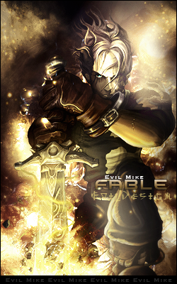
    good sense of depth and i like the main light source, although the light on his shin in the front is distracting from the main focal. I like the effects and the background, keep it up


  3. #3
    Join Date
    Mar 2009
    Posts
    2,831

    Default

    i like Fable the game, but on the sig the text is nice, I would suggest losing the border with your name repeated on the bottom, its just distracting. maybe try defining the focal point a little more too, KIU Evil Mike

Posting Permissions

  • You may not post new threads
  • You may not post replies
  • You may not post attachments
  • You may not edit your posts
  •  
Powered by vBadvanced CMPS v4.1.1