0 members and 2,345 guests
No Members online

» Site Navigation

» Stats

Members: 35,443
Threads: 103,072
Posts: 826,684
Top Poster: cc.RadillacVIII (7,429)
|
-
 Latest Work Latest Work
Hey, decided to show off some of my latest work, so tell what you all think, I'm really tryna to improve.
This one is in a SotW atm:
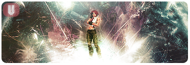
^I followed some steps to a tut for that one however. I know it's too sharp, and despite how it looks, I didn't use a light source cause it was already too bright and random. >_<
I experimented with this one after viewing this forum for a while, didn't follow a tutorial however, got really inspired to try to make something sexy. 
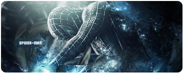
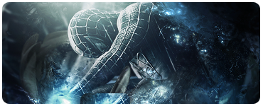
Text less:
Another experiment I've made an hour or so ago:
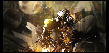
B&W Version 2:
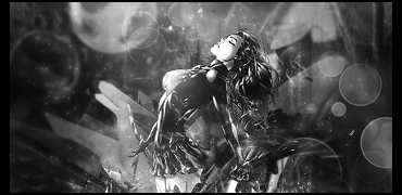
I have NO idea how to use bokeh, & I still suck a bit at using c4ds quite a lot (I think), that's where the CnC's come in.
Thank you for your time. :]
Last edited by JaySanity; 01-19-2011 at 10:22 PM.
-

On te spiderman one the on the bottom underneath his arm the blue looks like it's flat and the image is cut off, and that sticks out and ruins the blending a little.
The blue bubbles on the top right arnt blending very well with the focal or in the backround. They have potential but You arnt using them right. I would try lowering the opacity and playing around with what effect to put it on. Try Linear Dogdge
I really like the second one and think you did a great job on depth and everything and I like the lighting. I dont like B&W because you can't see all the great colors you've added and blending.
-

spidey is my fav on these the first feels really small for your focal less u trying make it like a sprite tag? kiu got some nice effects going on
-

@ RemixIsWin: I think what you're talking about is the clip mask I put there, maybe I could have found a better place to put there, or blurred it a bit. And the bubbles were too bright on linear dodge, they're on screen if I remember currently. I should have lowered them, might go back and edit the psd. And thanks!
@ sirenzo: Yeah the theme was sprites. And thank you. :]
Similar Threads
-
By fullmetall21 in forum Sigs & Manips
Replies: 0
Last Post: 12-17-2009, 04:49 AM
-
By ShadowFox1991 in forum Sigs & Manips
Replies: 3
Last Post: 11-03-2009, 02:57 PM
-
By Hazardous-gfx.com in forum Sigs & Manips
Replies: 9
Last Post: 10-12-2007, 02:02 PM
-
By Apprentice. in forum Sigs & Manips
Replies: 4
Last Post: 02-23-2007, 03:36 AM
-
By HeadShot in forum Digital Art
Replies: 11
Last Post: 07-08-2005, 12:36 PM
 Posting Permissions
- You may not post new threads
- You may not post replies
- You may not post attachments
- You may not edit your posts
-
Forum Rules
|


 Reply With Quote


