0 members and 1,018 guests
No Members online

» Site Navigation

» Stats
Members: 35,443
Threads: 103,072
Posts: 826,684
Top Poster: cc.RadillacVIII (7,429)
|
-
 New to this New to this
okay so i have been using gimp and recently made the switch to photoshop cs5.
i decided to follow some tuts found on another website but use my own renders and stocks. Feel free to tell me what u think.

-
nr five is your best imo.. colors and render fit nice... maybe some more effect in front of the render could add some flow and depth, but still me likez....
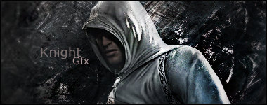
nr 1... well, with that render you might do the Assasins tut made by takken. you can find it on this site and comes with many outcomes to sse as example!! easy tut!!! much to be learnt!!
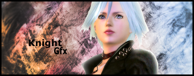
nr 2 and 3.. rmm i have problems with the colors here... they just don't match.. how to explain?? ehhh let me think...
sig nr 2 you made blue on the right... red on the left... that means that the envirament off the background changed exactly behind the render... odd isn't it?... better make the left side blue as well... that will give a mutch more pleasant look.
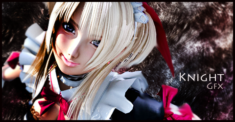
sig nr 3: you have a verry depri brown bg on wich you placed this happy colorfull girl...
but then.. you have a nice flow going on here.. so work on this one... make the color fit!!
nr 4: is just a head with an effect going on... no flow, no things that make me go ahhh.
but then this one has a nice colorscheme!
nr 5: now this one has got that: yeah!
textplacement, depth, good colors, nice render, nice detailed effects, blending..
to make this even better you might make a clipping-splatter and a sexy lightning!
if you don't know how to do that pm me or one of the mods... we will be happy to work you thru the ropes..
keep 'm coming !!
ohh and just one more small thing... these are signatures.... so they belong in a different section...
digital art is for larger artwork... but you couldn't know that since you are new here... 
Last edited by Xelo; 01-26-2011 at 05:36 PM.
From scratch, just smudging the XL way
-
im not sure im reading more tuts to fine tune everything i think im gonna follow them exact just so i can get a feel of techniques then try to develope my own style
-
You have some pretty nice work here! for a beginner!
For background:
- Choose an image that suits the render (unless your using a stock)
- Similarly, if you make a background use colours that are similar to the render
- Add space, fire, and other stocks (put them on 'Screen' so they blend)
- Or make the render HUGE then use the smudge tool to blend it all up!
For the Render:
- Look at smudging the render, make a few layers, mess about with the settings
- Smudge edges of the render (this is a useful effect)
Other effects:
- C4D, google em to see what they look like, these help add colour and depth to a sig!
- Fractuals (again google em)
Make sure the colours suit (and dont CLASHHH, it doesnt look pretty lol)
Also, very important this, make the tag have some flow
Hope this helps! Look forward to see (and cnc-ing) more work dude
 Posting Permissions
- You may not post new threads
- You may not post replies
- You may not post attachments
- You may not edit your posts
-
Forum Rules
|


 Reply With Quote


