0 members and 777 guests
No Members online

» Site Navigation

» Stats
Members: 35,443
Threads: 103,072
Posts: 826,684
Top Poster: cc.RadillacVIII (7,429)
|
View Poll Results: Winner?
- Voters
- 40. You may not vote on this poll
-
Duct Tape Man 
-
Twan 
-
Psypher 
-
Juicy 
-
Elleray 
-
Skarjoko 
-
Dick 
-
Underoath 
-
Joshkehm 
-
DinoKind 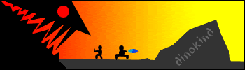
-
deep blue 
-
Jerner 
-
Atolar 
-
Xtremerunnerars 
-
Chemical 
-
Oblivion   
-
B][G K 
-
Oldeback 
-
Perfe 
-
iceryu 
-
Desitian 
-

Psypher For me...I Like the overall look of the sig..Great work Psypher
Simply; you.
-
Thanks guys =D
I wasn't expecting any votes, lol.
This is one of my older works ^^'
-
-
Psypher. something about it just makes me like it, i dont know what though...
I honestly dont really care if i get any votes, I just entered this just for the hell of it.
-
i think i shouldnt have added an animation to my sig....i'll go remove it and make it my current sig xD
DONT talk if you have NOTHING good to say.
-
Originally posted by deep blue@Jun 4 2005, 03:09 AM
does it say we cant use tuts?
NO
--------
my vote went for desititan, reason i didnt choose b][gks was that you wouldnt actually use that as a sig and if he had never made that car it would look pretty cruddy. reason i didnt vote twan was that he just took 4 stock photos, stuck them together added text - anyone can do that. and it doesnt even look like a sig.
[snapback]59326[/snapback]
There are plenty of other things I did to the sig Deep Blue. I am not going to take 4 pictures and put them together because that would take no skill. You seriously need to start observing some things in people's works. It's just a tip. Multiple times, you have criticized people's works in the showcase where there was actually many things edited in the work and done to the thing that you just didn't notice. Just look at something for more than 5 seconds, please.
-
I voted Twan's. Very nice and original.
-
ok, i looked closer, you added a weird low opac curve thing, added a pattern, probably enhanced the colors, anything else?
-
Correct to an extent. I did add a "weird low opac curve thing" and pattern. I added highlights and lighter colors to all 4. It may be simple but it gets the job done, as I could say about the signature you entered. It's simple, but it gets the job done. I've said this before- You don't need to work on something for 2 hours in order for it to look good.
-
Im with Twan in this argument...You dont need to do much to make it look nice, aslong as it gets the point across...
Oblivion

 Posting Permissions
- You may not post new threads
- You may not post replies
- You may not post attachments
- You may not edit your posts
-
Forum Rules
|


") i lost this one maybe the next one
i lost this one maybe the next one  ....owh wait i cant go on next week hahaha maybe the week after good luck guys
