GFXVoid Graphic Design Forum

Remove Text Formatting
Loading...

» Online Users: 1,963

0 members and 1,963 guests
No Members online

» Site Navigation

 > FAQ

» Stats

Members: 35,443
Threads: 103,072
Posts: 826,684
Top Poster: cc.RadillacVIII (7,429)
Welcome to our newest member, Lekelindids
Page 1 of 2 12 LastLast
Results 1 to 10 of 14
  1. #1
    Join Date
    Oct 2010
    Location
    Minnesota
    Posts
    152

    Default Another DS2 tag? I think so. CnC please.

    V1


    V2


    CnC please.
    Last edited by A Can Of Win; 02-01-2011 at 04:22 PM.

  2. #2
    Join Date
    Oct 2010
    Location
    Minnesota
    Posts
    152

    Default

    Please...? D:

  3. #3
    Join Date
    Aug 2009
    Location
    U.S.A
    Posts
    1,381

    Default

    Pretty cool effects i just hate that is to the bottom left

  4. #4
    Join Date
    Oct 2010
    Location
    Minnesota
    Posts
    152

    Default

    Finally, thanks.

  5. #5
    Join Date
    Oct 2010
    Location
    Minnesota
    Posts
    152

    Default

    Any more CnC?

  6. #6
    Join Date
    Oct 2010
    Location
    Minnesota
    Posts
    152

    Default

    This is pathetic. Nearly 100 views and only one comment. I can understand that some people like to just view some of the tags for whatever reason, but at least have the common courtesy to leave just a short comment. It's really not that complicated or time consuming. This is just plain ridiculous.

  7. #7
    Join Date
    Aug 2010
    Location
    Durpland.. (England)
    Posts
    329

    Default

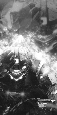
    I think it looks rude at the bottom left, although I am not a fan of using his as the BG aswell. Maybe a space stock, and some trippy C4D coming off/from him could improve this sig.!
    Liking the black and white, gj kiu!

    Mouuntx

  8. #8
    Join Date
    Aug 2010
    Location
    Scotland :)
    Posts
    629

    Default

    i agree that the positioning is weird, has a nice overall look, but i think it's the positioning like i said that's letting it down.

    Also, i think the top right is too distracting, maybe blur it a bit more?


    [My DeviantART]

    {x}{x}{x}
    Quote Originally Posted by DOMINOtm
    I know what you will have to do. This may sound a bit strange but it is the only logical option, you have to seduce your teacher

  9. #9
    Join Date
    Oct 2010
    Location
    Minnesota
    Posts
    152

    Default

    Thanks guys.

  10. #10
    Join Date
    Sep 2009
    Location
    nanananannannanan , bat- england
    Posts
    1,729

    Default

    You shouldn't of used that part of the render a background( i know in my sig that i used the focals face as the background but hey i'm a hypocrite XD)
    you should of used a different part, so like the armour or something or maybe even a background stock
    The positioning of the render looks a bit weird to me because it's a vert sig
    The effects are quite nice
    Overall it's an alright sig

Posting Permissions

  • You may not post new threads
  • You may not post replies
  • You may not post attachments
  • You may not edit your posts
  •  
Powered by vBadvanced CMPS v4.1.1