GFXVoid Graphic Design Forum

Remove Text Formatting
Loading...

» Online Users: 2,232

0 members and 2,232 guests
No Members online

» Site Navigation

 > FAQ

» Stats

Members: 35,443
Threads: 103,072
Posts: 826,684
Top Poster: cc.RadillacVIII (7,429)
Welcome to our newest member, Lekelindids
Results 1 to 6 of 6
  1. #1
    Join Date
    Dec 2010
    Posts
    1,145

    Default lurking in the darkness n_n


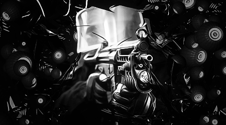
    yes its horrible and not meant to be black n white maybe ill upload ze colored version u_u
    cnc pretty please


  2. #2
    Join Date
    Jan 2011
    Location
    Oceanside, CA
    Posts
    184

    Default

    Doesn't look that bad to me, maybe darken the edges and add a small light source in there or something? I really don't think it looks that bad, personally anyway. Keep it up. ;p

    Edit: just work on making a flow next time. I have problems with that myself sometimes :s.

    Sexy gift from Slave! <3


  3. #3
    Join Date
    Sep 2009
    Location
    nanananannannanan , bat- england
    Posts
    1,729

    Default

    I like the way you've blended it in
    My only real complaint is I thinkt that there is a bit too much topaz
    And maybe blur some of it a bit ot create a better depth
    It's a pretty sweet tag dude
    Keep it up

  4. #4
    Join Date
    Dec 2010
    Posts
    1,145

    Default

    Quote Originally Posted by ketg View Post
    I like the way you've blended it in
    My only real complaint is I thinkt that there is a bit too much topaz
    And maybe blur some of it a bit ot create a better depth
    It's a pretty sweet tag dude
    Keep it up
    ill add a small light source and blur some of it, i would love to remove some topaz but i got a lot of applied images D:


  5. #5
    Join Date
    May 2010
    Posts
    1,942

    Default

    Not good for a black and white. The contrast is off and that goddamn topaz killed your depth.

    FX and BG are good.
    Kiu!


    My gift wall!
    My gift wall #2!
    My Genesis Tag Tutorial, check it out here!
    My Halo Tag Tutorial, check it out here!


  6. #6
    Join Date
    Nov 2010
    Location
    where i want
    Posts
    145

    Default

    I heard u liek topaz

    lol, I think the C4D's stick out too much and dont blend that well, mainly off to the left and right against the side

Similar Threads

  1. Darkness
    By cc.mio in forum Sigs & Manips
    Replies: 6
    Last Post: 05-30-2010, 02:48 PM
  2. Darkness
    By DeadlyShadow in forum Sigs & Manips
    Replies: 2
    Last Post: 11-06-2008, 08:26 AM
  3. [lp] darkness
    By Lumix in forum Digital Art
    Replies: 4
    Last Post: 08-11-2006, 06:18 AM
  4. Inner darkness
    By Tenchido in forum Sigs & Manips
    Replies: 5
    Last Post: 07-07-2006, 08:04 PM
  5. darkness
    By Soul in forum Digital Art
    Replies: 10
    Last Post: 08-05-2005, 01:32 PM

Posting Permissions

  • You may not post new threads
  • You may not post replies
  • You may not post attachments
  • You may not edit your posts
  •  
Powered by vBadvanced CMPS v4.1.1