GFXVoid Graphic Design Forum

Remove Text Formatting
Loading...

» Online Users: 3,490

0 members and 3,490 guests
No Members online

» Site Navigation

 > FAQ

» Stats

Members: 35,443
Threads: 103,072
Posts: 826,684
Top Poster: cc.RadillacVIII (7,429)
Welcome to our newest member, Lekelindids
Results 1 to 4 of 4

Thread: Genesis AD.3

  1. #1
    Join Date
    Sep 2010
    Location
    Philippines
    Posts
    873

    Default Genesis AD.3


    CnC plox. More c4d whoring. )

    FOLLOW ME ON DEVIANT ART!
    http://ejbonagua.deviantart.com/

  2. #2
    Join Date
    Dec 2010
    Location
    Manila, Philippines
    Posts
    306

    Default

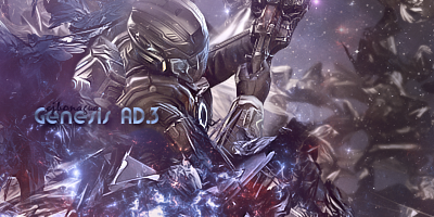
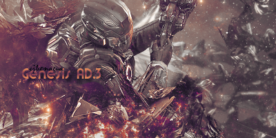
    v1 for me. But the textwork drops it for me. ( in my view) I might suggest it to be moved a little lower and i suggest it to be more simple and plain, just work on the placing. flow is good and Toning also works good for me.

  3. #3

    Default

    I will prefer V1 but don't keep the text there. Place it somewhere else and the render is blended too in bring it out by sharpening it a bit. But other is good. KIU.

  4. #4
    Join Date
    Sep 2010
    Location
    Philippines
    Posts
    873

    Default

    thanks guys

    FOLLOW ME ON DEVIANT ART!
    http://ejbonagua.deviantart.com/

Similar Threads

  1. genesis ad
    By Timentia in forum Sigs & Manips
    Replies: 6
    Last Post: 02-07-2011, 10:51 PM
  2. Genesis
    By schultz in forum Sigs & Manips
    Replies: 12
    Last Post: 12-29-2010, 05:53 AM
  3. Genesis AD.3 | CnC
    By ejbonagua in forum Sigs & Manips
    Replies: 9
    Last Post: 11-22-2010, 04:22 AM
  4. War of Genesis
    By DeadlyShadow in forum Sigs & Manips
    Replies: 5
    Last Post: 08-08-2008, 10:34 AM

Posting Permissions

  • You may not post new threads
  • You may not post replies
  • You may not post attachments
  • You may not edit your posts
  •  
Powered by vBadvanced CMPS v4.1.1