0 members and 401 guests
No Members online

» Site Navigation

» Stats
Members: 35,443
Threads: 103,072
Posts: 826,684
Top Poster: cc.RadillacVIII (7,429)
|
-
 My Logo My Logo
Just tested. Tips?
-
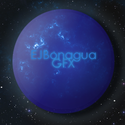
is this what you want as first impression?
-
-
I didn't get it either.
Well I don't like that it still looks flat, I dunno if you wanted it to be flat, or a sphere.
but remove the shadow if you want a sphere.
Text is kinda lame, Bigger text, no glow.
I dunno about logo's I dont actually have one but I do use my vectored panda on my renders.
and be more creative then just a circle, how many people have a circle logo? A LOT.
Background needs work as well. I myself would use one but idk
Keep at it.
-
This is way to fancy for a logo. As Pet says, "KISS". Simple designs often work best.
-
It is good that some people are listening to me. : )
Yes, keep it simple. As I like to say to myself, can this logo be scaled easily to fit on a store front, a link of clothes, a clothing tag, a business card, etc. What is the purpose of the planet in this?
Some other things I have never touched on, the words you use within it need to be carefully thought out. Is "EJBonagua" your first/second initial and last name? If it is, maybe just stick with first and last name, and put a space to separate them. As for adding "GFX," it looks tacky. I know a lot of graphic design websites have it in the name, but when you step into the realm of logos, things like that can be dropped.

Commissions and stickers available via linktree here.
-
 Originally Posted by Pet

It is good that some people are listening to me. : )
Yes, keep it simple. As I like to say to myself, can this logo be scaled easily to fit on a store front, a link of clothes, a clothing tag, a business card, etc. What is the purpose of the planet in this?
Some other things I have never touched on, the words you use within it need to be carefully thought out. Is "EJBonagua" your first/second initial and last name? If it is, maybe just stick with first and last name, and put a space to separate them. As for adding "GFX," it looks tacky. I know a lot of graphic design websites have it in the name, but when you step into the realm of logos, things like that can be dropped.
Well, whenever I am about to say something like vector I go to one of your posts to make sure I am not talking about something else D:
-
Originally Posted by Pet
It is good that some people are listening to me.
Whoever doesn't should get banned for being stupid ")
-
Elipse, i wanted it like a button. idk how to use the c4d option on cs5 to make a sphere. thanks tho
Shiv, thanks
Pet, EJ(my first name, nickname), my middle initial is F, last name is bonagua. thanks for the tips
-
Similar Threads
-
By schultz in forum Digital Art
Replies: 14
Last Post: 06-06-2010, 11:34 PM
-
By Likenota in forum Digital Art
Replies: 3
Last Post: 01-12-2007, 02:15 PM
-
By Sumomo in forum Digital Art
Replies: 2
Last Post: 09-27-2005, 05:13 PM
-
By GodSquad in forum Digital Art
Replies: 10
Last Post: 07-29-2005, 06:54 AM
-
By static06 in forum Digital Art
Replies: 6
Last Post: 07-12-2005, 12:09 AM
 Posting Permissions
- You may not post new threads
- You may not post replies
- You may not post attachments
- You may not edit your posts
-
Forum Rules
|


 Reply With Quote


