GFXVoid Graphic Design Forum

Remove Text Formatting
Loading...

» Online Users: 5,060

0 members and 5,060 guests
No Members online

» Site Navigation

 > FAQ

» Stats

Members: 35,443
Threads: 103,072
Posts: 826,684
Top Poster: cc.RadillacVIII (7,429)
Welcome to our newest member, Lekelindids
Results 1 to 5 of 5

Thread: R O X A S

  1. #1
    Join Date
    Feb 2011
    Location
    BC
    Posts
    37

    Default R O X A S

    A tad plain but I think it works.


    c&c

  2. #2
    Join Date
    Oct 2009
    Location
    The Netherlands
    Posts
    2,776

    Default

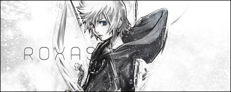
    Very nice! The blue eyes might be a littlebit more prominent, to make 'm stand out more.
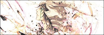
    It is not plain! but the right side needs just a hint of contrast, to make the dots come out a bit. Sometimes less is more. You just made an example of that right here!! Love it!

  3. #3
    Join Date
    Jan 2011
    Posts
    26

    Default

    nice

  4. #4
    Join Date
    Aug 2010
    Location
    Scotland :)
    Posts
    629

    Default

    it's pretty nice, it's not plain, it's clean

    Text could use a bit of work, and i agree with xelo.

    + what font is that?


    [My DeviantART]

    {x}{x}{x}
    Quote Originally Posted by DOMINOtm
    I know what you will have to do. This may sound a bit strange but it is the only logical option, you have to seduce your teacher

  5. #5
    Join Date
    Feb 2011
    Location
    BC
    Posts
    37

    Default

    Quote Originally Posted by Ebrithil View Post
    it's pretty nice, it's not plain, it's clean

    Text could use a bit of work, and i agree with xelo.

    + what font is that?
    http://www.dafont.com/sweet-confusion.font

Posting Permissions

  • You may not post new threads
  • You may not post replies
  • You may not post attachments
  • You may not edit your posts
  •  
Powered by vBadvanced CMPS v4.1.1