GFXVoid Graphic Design Forum

Remove Text Formatting
Loading...

» Online Users: 5,708

0 members and 5,708 guests
No Members online

» Site Navigation

 > FAQ

» Stats

Members: 35,443
Threads: 103,072
Posts: 826,684
Top Poster: cc.RadillacVIII (7,429)
Welcome to our newest member, Lekelindids
Page 1 of 2 12 LastLast
Results 1 to 10 of 16

Thread: Sig needs C&C

  1. #1
    Join Date
    May 2005
    Posts
    690

    Default

    http://i3.photobucket.com/albums/y77...eryugtasty.png

    edit :
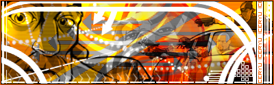
    without the text because theres some at the right
    http://i3.photobucket.com/albums/y77/icery...gtastyedit1.png

    edit2 :
    added somemore getting better dont you think? haha
    http://i3.photobucket.com/albums/y77/icery...eryugtasty2.png
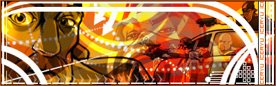
    edit3 :
    changed the aboves to link to reduce the size of the board
    ------
    removed the dotted stuff at the top...and maked the text a darker orange


    compare :


    just thought if trying something different other than abstract background and just a render over it....so what do you think guys? C&C?
    DONT talk if you have NOTHING good to say.

  2. #2
    Join Date
    May 2005
    Posts
    470

    Default

    text could use some work and i am not sure the colors match the renders very well...

  3. #3
    Join Date
    May 2005
    Posts
    690

    Default

    any ideas on the text cant really find any nice ones >< thanks
    DONT talk if you have NOTHING good to say.

  4. #4
    Join Date
    Feb 2005
    Posts
    1,492

    Default

    I like the updated version a lot more. The use of colours and shapes is really appealing and the whole sig just screams "originality". All of the renders are put in the right place as far as I can see and the blending (or lack there of) is well suited to each of the individual renders. Also, I like the placement of the text.

  5. #5
    Join Date
    May 2005
    Posts
    690

    Default

    thanks for your comments fade .....anything in the sig that makes it ummm not very nice? haha
    DONT talk if you have NOTHING good to say.

  6. #6
    Join Date
    Jun 2005
    Posts
    52

    Default

    Yeah. I like it. It seems really original and it looks good.

  7. #7
    Join Date
    May 2005
    Posts
    690

    Default

    thanks naraku
    DONT talk if you have NOTHING good to say.

  8. #8
    Join Date
    Apr 2005
    Location
    Texas
    Posts
    3,199

    Default

    thats tight man i saw it and looked for this post just to comment i love that work its kcik ass tho id get rid of the faded grey render and get rid on the scanlines and make the iceryu text animated in a marquee scroll. great color choise and renders
    Creator of the GFXvoid Header......................................Retired GFXvoid Staff.
    Currently: Never Here

  9. #9
    Join Date
    Mar 2005
    Location
    Toronto
    Posts
    2,079

    Default

    eugh, cant wait till this vector craze is done and over with.
    any way, the GTA render on the left does not work at all well with the one on the right, the GTA render on the right would have been fine.


  10. #10
    Join Date
    Jun 2005
    Location
    Canada
    Posts
    451

    Default

    Very nice work. The transparent grey render in the back may need to go though. Other than that its really cool~&#33; gj&#33;

Posting Permissions

  • You may not post new threads
  • You may not post replies
  • You may not post attachments
  • You may not edit your posts
  •  
Powered by vBadvanced CMPS v4.1.1