GFXVoid Graphic Design Forum

Remove Text Formatting
Loading...

» Online Users: 700

0 members and 700 guests
No Members online

» Site Navigation

 > FAQ

» Stats

Members: 35,443
Threads: 103,072
Posts: 826,684
Top Poster: cc.RadillacVIII (7,429)
Welcome to our newest member, Lekelindids
Results 1 to 7 of 7

Thread: GoW Sig

  1. #1

    Default GoW Sig


  2. #2
    Join Date
    Jul 2009
    Location
    Brooklyn, New York
    Posts
    1,604

    Default

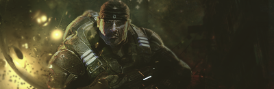
    Pretty nice sig there. A bit dark brightness and contrast could fix that. Lighting is nice as well as concept. Maybe a bit of work on foreground but not necessary. Good Job kiu.

    EDIT-Try to work on bigger canvases but that's just me.

    My Three Rules Of Making a Sig Flow, Lighting and Depth


  3. #3
    Join Date
    Nov 2008
    Location
    USA - New Hampshire
    Posts
    627

    Default

    Great lighting and depth on this signature. Technically very well composed but a bit dark.

  4. #4
    Join Date
    Dec 2010
    Posts
    656

    Default

    I don't know, I think the lighting could be improved upon. Just look at the render then the background, doesn't really make sense.

  5. #5
    Join Date
    Feb 2011
    Location
    India
    Posts
    196

    Default

    Excellent Blending.
    Good Depth.
    Brightness and Contrast can see some tweak.
    kiu m8

    <3 Thanks for this awesome Gift Slave.

  6. #6

    Default

    Cheers for the comments and tips people.


  7. #7
    Join Date
    Jan 2011
    Location
    Michigan
    Posts
    220

    Default

    i like the lighting depth is ok

Posting Permissions

  • You may not post new threads
  • You may not post replies
  • You may not post attachments
  • You may not edit your posts
  •  
Powered by vBadvanced CMPS v4.1.1