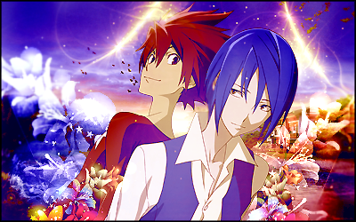
hey bud! I like your idea of creating contrasting sides. If you had made each side equal, it would look even better. The render needs to be blended a little more, I can see pixelation around the edges. instead of making the left side blue and right side red, I would suggest switching that idea around, and have red with red and blue with blue. You'd retain the contrast you were going for while adding some unity to the tag. I also think that the black areas on the bottom should be replaced by that bg you have there. There's some flowers on the left guy while the right guy has nothing. Maybe throw some of those flowers on him as well. The arcing light is nice, but those strange objects floating nearby them are a little distracting and don't really help the tag much. I suggest throwing some warmth in here as well, and a B&W gradient map for depth as well. That's all I can see for now. I hope this didn't sound too harsh, just giving my opinion since I want to help you improve (well, whether or not this cnc is correct is beyond me though). Good luck and I hope your friend likes it!
l8er days
Thanks for the gift Stu!
"It is difficult to say what is impossible, for the dream of yesterday is the hope of today, and the reality of tomorrow." - Robert H. Goddard
Well, I wanted to keep the red on the left guy and the blue on the right guy cause those are the colors of the characters and cause it'll be more noticeable to my friend since it's a gift. The render wasn't really high quality and i guess I over-sharpened it, :/. I see where you're coming from on the flowers, but I wanted to create a little bit of depth by making the flowers behind one and in front of one. Don't worry, you didn't sound harsh, you gave your opinion, .


 Reply With Quote


 .
.