0 members and 4,205 guests
No Members online

» Site Navigation

» Stats
Members: 35,443
Threads: 103,072
Posts: 826,684
Top Poster: cc.RadillacVIII (7,429)
|
-
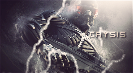
 Crysis Sig Crysis Sig
Here is a new crysis sig i made for a Twisted Puppets Tag wall, tell me what you think!
V2
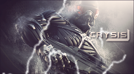
For some reason, the lightning is messed up, thats not what it looks like on my comp. Ill play with the settings later 
Last edited by Kinetics; 03-28-2011 at 07:57 PM.
-
Liked some textures you used. REMOVE THOSE FUCKING LINES. Just erase A BIT of the lightning. The rest is kinda cool bro, gj
-
-
-
Oh the lightning,  Yeah, i wanted it to be like gaafjeahs half life sig, but it didnt work Yeah, i wanted it to be like gaafjeahs half life sig, but it didnt work
-
Lighting and text are both very poor.
Your text is auto-distracting and the soft brush lighting is ruining the actually definition of lighting and the appeal of the signature.
Your focal is too big.
You lack effects, therefore nothing pops out which brings down your depth.
The lightning looks horrid, remove it asap.
Kiu.
-
 Originally Posted by Derosion

Lighting and text are both very poor.
Your text is auto-distracting and the soft brush lighting is ruining the actually definition of lighting and the appeal of the signature.
Your focal is too big.
You lack effects, therefore nothing pops out which brings down your depth.
The lightning looks horrid, remove it asap.
Kiu.
THANK YOU! I was wondering why my lightning looked bad, it was on a soft brush! But without the lightning, it is too empty, well, i guess i will work on that now
-
if you want to have some lightnings find some image on google and set it to lighten or linear dodge
 ^thanks for the epic gift AGITATOR!
Similar Threads
-
By Elveon in forum Sigs & Manips
Replies: 3
Last Post: 03-15-2011, 07:33 PM
-
By Gecko81 in forum Sigs & Manips
Replies: 7
Last Post: 08-28-2010, 11:50 AM
-
By Derosion in forum Sigs & Manips
Replies: 21
Last Post: 07-18-2010, 12:30 PM
-
By Derosion in forum Sigs & Manips
Replies: 1
Last Post: 07-16-2010, 05:55 AM
-
By +s9.Oath in forum Sigs & Manips
Replies: 3
Last Post: 06-28-2010, 09:31 AM
 Posting Permissions
- You may not post new threads
- You may not post replies
- You may not post attachments
- You may not edit your posts
-
Forum Rules
|


 Reply With Quote


