GFXVoid Graphic Design Forum

Remove Text Formatting
Loading...

» Online Users: 418

0 members and 418 guests
No Members online

» Site Navigation

 > FAQ

» Stats

Members: 35,443
Threads: 103,072
Posts: 826,684
Top Poster: cc.RadillacVIII (7,429)
Welcome to our newest member, Lekelindids
Results 1 to 6 of 6

Thread: Spiderman

  1. #1
    Join Date
    May 2009
    Location
    Virginia, USA
    Posts
    383

    Default Spiderman

    Alright so I stayed away from textures, and fractals and tried to get something I liked anyway cnc?


    V2

    Last edited by JDragon; 04-04-2011 at 08:37 PM.
    Awesomely Epic Gifty from ChanceB ---V


    Epic gift from Oath xD
    Gift from Agitator Gift from SirenzoGift From AgitatorGift From Stryd3r 9Y0

  2. #2
    Join Date
    Apr 2009
    Location
    England, Newcastle Upon Tyne
    Posts
    996

    Default

    I'll start off by saying get rid of the text. It looks out of place in the corner, and i think this piece would look better without it. But if you must, then i'd say put it close to the focal so the attention isn't stolen away from it. The effects are quite nice but a little low quality so touch it up a little 
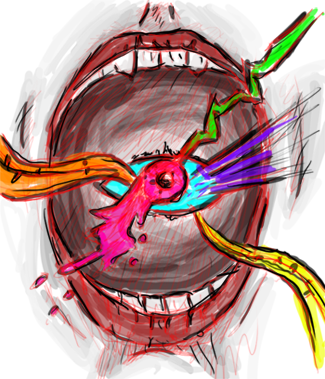
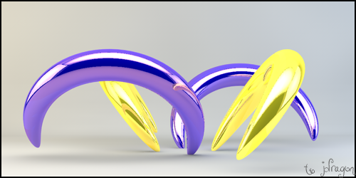
I think the colors fit nicely but you overdone the blur on the front leg, but good idea for depth. Overall, i think it's nice but maybe take some things in that i've said. Keep it up, good job.
    ~Deviantart~

    Youtube : www.youtube.com/MrDeanage

  3. #3
    Join Date
    May 2009
    Location
    Virginia, USA
    Posts
    383

    Default

    Alright hmmm decided to try something with it since I saw what you were talking about and updated with a 2nd version xD
    Awesomely Epic Gifty from ChanceB ---V


    Epic gift from Oath xD
    Gift from Agitator Gift from SirenzoGift From AgitatorGift From Stryd3r 9Y0

  4. #4
    Join Date
    May 2009
    Location
    Virginia, USA
    Posts
    383

    Default

    bumpage xD
    Awesomely Epic Gifty from ChanceB ---V


    Epic gift from Oath xD
    Gift from Agitator Gift from SirenzoGift From AgitatorGift From Stryd3r 9Y0

  5. #5
    Join Date
    Jan 2011
    Location
    Houston/Huntsville, TX
    Posts
    412

    Default

    I like v2 only because the text is off. But I like everything else on the first one better. I think you should improve on your blending a bit more. Maybe have some of the effects going over his feet or something. Keep it up.

  6. #6

    Default

    it lacks depth and lighting


    ^thanks for the epic gift AGITATOR!

    SOTW:261|265|288|308 |edwinpabito.deviantart.com


Similar Threads

  1. Spiderman - (AGAIN)
    By Lewk in forum Sigs & Manips
    Replies: 9
    Last Post: 06-05-2009, 04:57 AM
  2. Spiderman
    By tekken in forum Sigs & Manips
    Replies: 10
    Last Post: 05-03-2009, 09:23 PM
  3. Spiderman
    By Kievit in forum Sigs & Manips
    Replies: 8
    Last Post: 04-16-2009, 09:35 AM
  4. )Spiderman (everyone has one
    By navb01 in forum Sigs & Manips
    Replies: 11
    Last Post: 04-12-2009, 11:02 AM
  5. Spiderman
    By AntiEmperor in forum Sigs & Manips
    Replies: 0
    Last Post: 08-03-2008, 06:29 PM

Posting Permissions

  • You may not post new threads
  • You may not post replies
  • You may not post attachments
  • You may not edit your posts
  •  
Powered by vBadvanced CMPS v4.1.1