GFXVoid Graphic Design Forum

Remove Text Formatting
Loading...

» Online Users: 906

0 members and 906 guests
No Members online

» Site Navigation

 > FAQ

» Stats

Members: 35,443
Threads: 103,072
Posts: 826,684
Top Poster: cc.RadillacVIII (7,429)
Welcome to our newest member, Lekelindids
Results 1 to 8 of 8

Thread: The Book

  1. #1
    Join Date
    Jan 2011
    Location
    Houston/Huntsville, TX
    Posts
    412

    Default The Book


    New one without the bubble stock & darker shadows.
    Last edited by AnthonyE; 04-05-2011 at 01:48 AM.

  2. #2
    Join Date
    Apr 2009
    Location
    England, Newcastle Upon Tyne
    Posts
    996

    Default

    I quite like this one. I think this would be a sick piece if only there was more depth. The lighting is great, and i'd also get rid of the lil text you put on :P it just doesn't fit. But overall nice job.
    ~Deviantart~

    Youtube : www.youtube.com/MrDeanage

  3. #3
    Join Date
    Feb 2011
    Location
    New York City
    Posts
    1,113

    Default

    It's awesome, ^^. Could use a bit of contrast though.

  4. #4
    Join Date
    Feb 2011
    Location
    Argentina.
    Posts
    1,387

    Default

    I like the feeling of this one, text is terrible tho lol remove it
    enzo <3


  5. #5
    Join Date
    Jan 2011
    Location
    Houston/Huntsville, TX
    Posts
    412

    Default

    Quote Originally Posted by ShorterGFX View Post
    I quite like this one. I think this would be a sick piece if only there was more depth. The lighting is great, and i'd also get rid of the lil text you put on :P it just doesn't fit. But overall nice job.
    Thanks! I took off the text.

    Quote Originally Posted by Razer GFX View Post
    It's awesome, ^^. Could use a bit of contrast though.
    You should know me by now. I LIKE MY SIGNATURES AS DULL AS POSSIBLE.

    Quote Originally Posted by Ishamz View Post
    I like the feeling of this one, text is terrible tho lol remove it
    lol, thanks. I removed the text.

  6. #6
    Join Date
    Feb 2011
    Location
    New York City
    Posts
    1,113

  7. #7
    Join Date
    May 2009
    Location
    Virginia, USA
    Posts
    383

    Default

    Looks a lot better without the text 
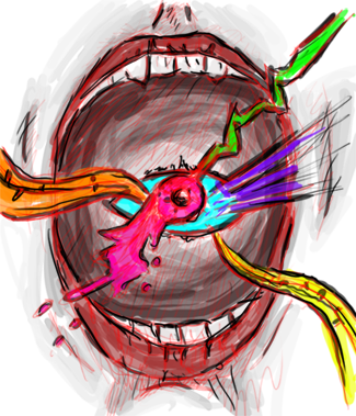
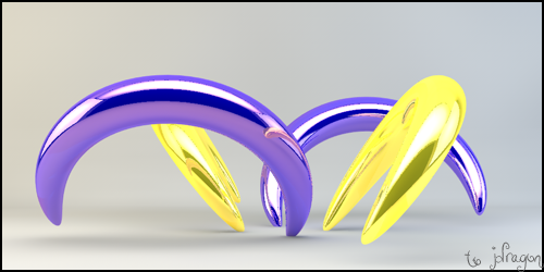
the stuff at the bottom I'm guessing the c4d or the clipping mask seems to be a distraction but overall good job xD
    Awesomely Epic Gifty from ChanceB ---V


    Epic gift from Oath xD
    Gift from Agitator Gift from SirenzoGift From AgitatorGift From Stryd3r 9Y0

  8. #8
    Join Date
    Jan 2011
    Location
    Houston/Huntsville, TX
    Posts
    412

    Default

    Thanks.

    For those who would like to see, I have added a v2 with no blue bubble stock and darker shadows. Thanks

Similar Threads

  1. the book of eli
    By Jay X in forum Sigs & Manips
    Replies: 4
    Last Post: 08-01-2010, 07:56 PM
  2. A book
    By Breäkdown in forum Sigs & Manips
    Replies: 2
    Last Post: 02-23-2009, 05:21 PM
  3. Coloring Book - #2
    By s0ggywaffls in forum Digital Art
    Replies: 6
    Last Post: 07-10-2007, 06:35 PM
  4. Favorite book
    By Spid3r in forum The Void
    Replies: 42
    Last Post: 02-01-2006, 04:47 AM

Posting Permissions

  • You may not post new threads
  • You may not post replies
  • You may not post attachments
  • You may not edit your posts
  •  
Powered by vBadvanced CMPS v4.1.1