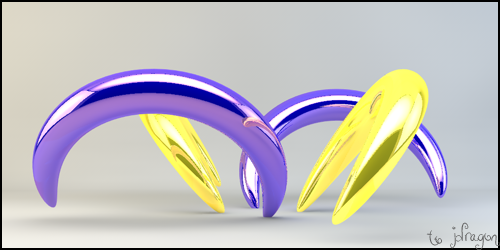
Extra attention to the render,made it HQ,now I see the BG could've use some HQ pimping...(oh,well..in do time I guess..)
Also extra work on the text...
Fire away boys..
|
|


Loading...
|
» Online Users: 1,096
|
Results 1 to 4 of 4
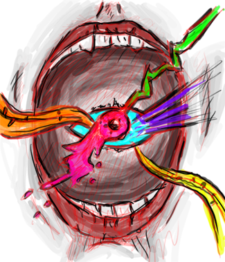
Thread: Frosmoutne hungers...
|


 Reply With Quote