GFXVoid Graphic Design Forum

Remove Text Formatting
Loading...

» Online Users: 349

0 members and 349 guests
No Members online

» Site Navigation

 > FAQ

» Stats

Members: 35,443
Threads: 103,073
Posts: 826,685
Top Poster: cc.RadillacVIII (7,429)
Welcome to our newest member, Lekelindids
Results 1 to 4 of 4
  1. #1
    Join Date
    Sep 2010
    Location
    sheffield , england
    Posts
    108

    Default Ghost Recon - LFC908


    first sig in a while. C&C

  2. #2
    Join Date
    Mar 2011
    Posts
    639

    Default

    i like it, looks lq tho and you messed up the blur

  3. #3
    Join Date
    Feb 2008
    Location
    Toronto, Canada
    Posts
    4,831

    Default

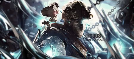
    Not terribly LQ in my opinion. And the blur is alright IMO too. Just a different way of looking at it. Like how the colours all match, and the focal point is well defined.

    My main concern is the text, and it could use some work. Perhaps a white font? Just my opinion, but I like what is done. Keep it up!


  4. #4

    Default

    agree with immortal
    i like the flow and its lil HQ for me and i like it...try darkening some spots to emphasize the lighting


    ^thanks for the epic gift AGITATOR!

    SOTW:261|265|288|308 |edwinpabito.deviantart.com


Similar Threads

  1. Ghost RECON
    By Comedy_NL in forum Sigs & Manips
    Replies: 3
    Last Post: 05-29-2009, 05:59 AM
  2. Ghost Recon Sig.
    By Cap'n Jazz in forum Sigs & Manips
    Replies: 4
    Last Post: 07-16-2008, 08:56 PM
  3. Ghost Recon
    By .heKtik in forum Digital Art
    Replies: 4
    Last Post: 04-27-2007, 12:08 PM
  4. Ghost Recon
    By HOMiE in forum Resources
    Replies: 11
    Last Post: 05-29-2006, 03:47 PM
  5. Ghost Recon 3
    By S-Gen. in forum The Void
    Replies: 13
    Last Post: 08-13-2005, 12:01 AM

Posting Permissions

  • You may not post new threads
  • You may not post replies
  • You may not post attachments
  • You may not edit your posts
  •  
Powered by vBadvanced CMPS v4.1.1