GFXVoid Graphic Design Forum

Remove Text Formatting
Loading...

» Online Users: 6,442

0 members and 6,442 guests
No Members online

» Site Navigation

 > FAQ

» Stats

Members: 35,443
Threads: 103,072
Posts: 826,684
Top Poster: cc.RadillacVIII (7,429)
Welcome to our newest member, Lekelindids
Results 1 to 8 of 8
  1. #1
    Join Date
    May 2009
    Location
    Virginia, USA
    Posts
    383

    Default Dreamcatcher (Collab With RazerGFX)

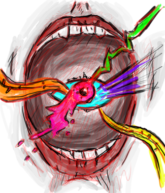
    Alright so RazerGFX started it and I finished it

    This is what it started with


    and this is the end result


    V2 with fixed face
    Last edited by JDragon; 04-16-2011 at 11:45 AM.
    Awesomely Epic Gifty from ChanceB ---V


    Epic gift from Oath xD
    Gift from Agitator Gift from SirenzoGift From AgitatorGift From Stryd3r 9Y0

  2. #2
    Join Date
    Apr 2011
    Posts
    39

    Default

    I dont like the far left, where you copied the render again, also, its sharpened too much, other wise, good work
    "Don't let Victories go to your head, or defeats to your heart."

  3. #3
    Join Date
    May 2009
    Location
    Virginia, USA
    Posts
    383

    Default

    Actually it wasn't the sharpen lol it was the effects that were done through out all of it that caused that hmmm let me try something I think I can fix that actually.
    Awesomely Epic Gifty from ChanceB ---V


    Epic gift from Oath xD
    Gift from Agitator Gift from SirenzoGift From AgitatorGift From Stryd3r 9Y0

  4. #4
    Join Date
    Apr 2011
    Posts
    39

    Default

    Looks great now ;D
    "Don't let Victories go to your head, or defeats to your heart."

  5. #5
    Join Date
    Aug 2009
    Location
    U.S.A
    Posts
    1,381

    Default

    I like the first better.
    But idk all of them look LQ

  6. #6
    Join Date
    Sep 2009
    Location
    nanananannannanan , bat- england
    Posts
    1,729

    Default

    I prefer the first one, I don't really like the very bright stars though~

  7. #7
    Join Date
    Apr 2011
    Posts
    153

    Default

    the first one looks better


    thanks STRID3R 9YO

  8. #8
    Join Date
    May 2010
    Location
    Australia
    Posts
    1,223

    Default

    tbh the first one does look better.
    It had nice depth and subtle effects going.
    V2 looks overcontrasted and seems to haven gotten rid off the depth and added a duplicate. I've always hated duplicates :P

Similar Threads

  1. Dreamcatcher LP Comp entry - adcar
    By Scrib in forum Digital Art
    Replies: 15
    Last Post: 11-07-2010, 04:32 AM
  2. Looking for a Collab
    By Downfall in forum The Void
    Replies: 4
    Last Post: 10-24-2010, 02:27 PM
  3. AIM Collab?
    By Trauma in forum Sigs & Manips
    Replies: 4
    Last Post: 09-18-2009, 03:09 AM
  4. B-T-W Collab
    By Magnum in forum Digital Art
    Replies: 3
    Last Post: 06-27-2006, 07:45 AM
  5. Collab
    By Xobile in forum Digital Art
    Replies: 3
    Last Post: 05-13-2006, 08:36 PM

Posting Permissions

  • You may not post new threads
  • You may not post replies
  • You may not post attachments
  • You may not edit your posts
  •  
Powered by vBadvanced CMPS v4.1.1