GFXVoid Graphic Design Forum

Remove Text Formatting
Loading...

» Online Users: 5,714

0 members and 5,714 guests
No Members online

» Site Navigation

 > FAQ

» Stats

Members: 35,443
Threads: 103,072
Posts: 826,684
Top Poster: cc.RadillacVIII (7,429)
Welcome to our newest member, Lekelindids
Results 1 to 4 of 4

Thread: Scorpion

  1. #1

    Default Scorpion

    Proud Owner of:
    RichFlyers
    Skype: NovruzeliHuseynov


    ^ LOVE YOU RAD ^


  2. #2
    Join Date
    Dec 2010
    Posts
    971

    Default

    Color scheme is completely off imo, text is bad, lighting seems off, and it seems oversharpened, but then again im still an amateur so idk.

  3. #3

    Default

    kk thanks anyway.
    Proud Owner of:
    RichFlyers
    Skype: NovruzeliHuseynov


    ^ LOVE YOU RAD ^


  4. #4
    Join Date
    Apr 2011
    Location
    New York.
    Posts
    63

    Default

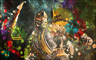
    The signature would look really good, but it is way too oversharpened. That is the only flaw I see. The colors really stand out in a good way. I like the cloud effect and the splatters but they should be on lighten or something like that not on half opacity. I think you should look at some text placement tutorials. Everyone has potential. Keep it up meng.

Similar Threads

  1. Scorpion
    By jerry in forum Sigs & Manips
    Replies: 5
    Last Post: 10-17-2005, 04:01 PM
  2. scorpion
    By imported_starcraft in forum Digital Art
    Replies: 17
    Last Post: 09-15-2005, 10:05 AM
  3. Scorpion
    By xProphet in forum Digital Art
    Replies: 9
    Last Post: 08-29-2005, 09:46 AM
  4. Scorpion
    By Wiseson in forum Digital Art
    Replies: 5
    Last Post: 07-21-2005, 03:20 AM
  5. Scorpion sig
    By graffic in forum Sigs & Manips
    Replies: 7
    Last Post: 02-11-2005, 11:37 PM

Posting Permissions

  • You may not post new threads
  • You may not post replies
  • You may not post attachments
  • You may not edit your posts
  •  
Powered by vBadvanced CMPS v4.1.1