0 members and 3,313 guests
No Members online

» Site Navigation

» Stats
Members: 35,443
Threads: 103,072
Posts: 826,684
Top Poster: cc.RadillacVIII (7,429)
|
-
-

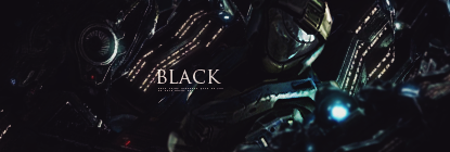
love the effects tho your colors looked washed out . great job on lighting,. i don't see much flow looks all over the place, imo kiu m8.
-
i dont see much details maybe some sharpening will be better..
 ^thanks for the epic gift AGITATOR!
-
That shit looks wicked. Focal is a bit small, but otherwise a well done tag . .
-
very nice Feng tag man it fits how he is in the game very nice effects man keep it up
-
nice flow nice effects nice colors man kiu really liking the sig
-
I love the creeping veins stuff, that is a bonus in texture man !!1
I would agree with imma on this one, the focal seems small to me, but I can understand why you made him small so as to get a good feel for what he is doing.
The orbish fire is jawsome too, really cool concept, maybe try an put one or two of those to thefar bottom right ? so like running the angle of them ?
 Radi's one of a kind gift <3
 ^My Wish List^

-
I actually like the washed out look that the colors have. The C4D's and the cloud looking effects all look very nice. I like the render placement. I think that the bubbles near the render should be taken out because they take away from the rest of the nice looking tag. I think you should add some text near his arm. Also, tone down the bright lights a bit. Kiu meng.
-
-
The background looks sick.
If I had to CnC I would say just a tiny bit of blending 
But I don't think it's needed at all, gj 
Similar Threads
-
By cC.Midway in forum Digital Art
Replies: 0
Last Post: 11-25-2009, 01:27 PM
-
By .ionide in forum Digital Art
Replies: 13
Last Post: 11-16-2005, 07:47 PM
-
By PP Bone in forum Sigs & Manips
Replies: 5
Last Post: 07-10-2005, 04:16 PM
-
By Ako. in forum Digital Art
Replies: 7
Last Post: 07-04-2005, 07:13 PM
-
By l0r3nz0 in forum Sigs & Manips
Replies: 3
Last Post: 06-25-2005, 01:52 PM
 Posting Permissions
- You may not post new threads
- You may not post replies
- You may not post attachments
- You may not edit your posts
-
Forum Rules
|


 Reply With Quote