0 members and 7,631 guests
No Members online

» Site Navigation

» Stats
Members: 35,443
Threads: 103,072
Posts: 826,684
Top Poster: cc.RadillacVIII (7,429)
|
-
 Destruction - Kinetics Destruction - Kinetics
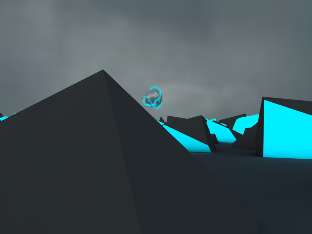
And the backstory that i made up like 2 seconds ago 
"Well, the story behind it is, that lightning ball thingy, destroyed the civilization that was there, and the blocky/pyramid things are the pieces that remain of the civilization"
Anyways, tell me how to improve it, it was made using C4d, and photoshop.
-
Put some more emphasis on that destructive electric sphere "thingy". I imagine it being a bit bigger, and placed maybe in the top right side. It's also a bit blurry / unfocused.
The placement of the elements themselves is a bit awkward. For instance, the ball should grab my attention, but the blue stuff on the right caught me first, and the bigger pyramid on the left next, and then finally the ball. The blurriness in the image overall made me squint to figure out what was going on, and to be honest I had no idea until I read your description.
I do like the style. Vector / 3d is always a good combination, but it's definitely something you would have found back in the early 2000s (like 2advanced-esque stuff). The colors are nice as well, although a bit minimal.
This could really use a prominent light source.
Nice job.
-
Mhm, the actually destructing ball needs more emphasizing + the whole thing needs more detail.
Seems like a wip atm.
-
Okay, thanks guys, although i had no idea that this was a vector style, but im new to c4d, so ofc its not the best
-
i wanna cry when i see this lonely bubble
just kiddin
i think the all picture need more details becuse its some kind of empty something like that
but stiil youve done a very good job kiu
-
 Originally Posted by Kinetics

Okay, thanks guys, although i had no idea that this was a vector style, but im new to c4d, so ofc its not the best
The only reason I said this was a "vector" style, was because of the two-tone shapes and almost nonexistent shading (in fact I don't think there is any shading if you don't count the shadows at the bases of the buildings). When I think of vector, I think of flat design and solid colors. Having a vector style doesn't necessarily mean it is in fact a vector design; it just has vector qualities.
Hope I didn't confuse you.
Similar Threads
-
By Slave in forum Sigs & Manips
Replies: 10
Last Post: 05-07-2011, 07:44 PM
-
By Kinetics in forum Sigs & Manips
Replies: 9
Last Post: 05-07-2011, 03:44 AM
-
By Kinetics in forum Sigs & Manips
Replies: 11
Last Post: 04-13-2011, 12:12 AM
-
By Kinetics in forum The Void
Replies: 2
Last Post: 01-22-2011, 01:31 PM
 Posting Permissions
- You may not post new threads
- You may not post replies
- You may not post attachments
- You may not edit your posts
-
Forum Rules
|


 Reply With Quote


