0 members and 557 guests
No Members online

» Site Navigation

» Stats
Members: 35,443
Threads: 103,072
Posts: 826,684
Top Poster: cc.RadillacVIII (7,429)
|
-
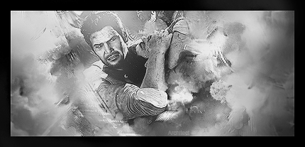
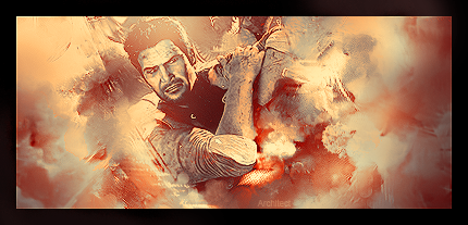
 Uncharted Smudge :) Uncharted Smudge :)
B&W:
Color:
-
Smudge is nice,render doesn't blend with the smudge,it's like he doesn't want the smudge,that's because you didn't smudge the main render itself.And not much,just the edges.Plus too much sharpness,looks LQ that way.
KIU brah.
-
Agreed with strider. Also, text is just bad like that imho, find a better place for it or just leave it out altogether. I'm likin the colored one more, even tho i don't rly like the colors.. lol xD
-
It seems like the smude isn't going well with the render itself, too much sharpness, try using different colors.
Nice.
-
BORDER!! is the first thing i see!!... the colord version sucks, but the BW works good!!
the smudging is awsum man!! you've got it in you! but what i see is flow in all directions. What you need to do is to make an overall flow in your final smudging!! then this would be sex!! More of this please!!
From scratch, just smudging the XL way
Similar Threads
-
By exclusive in forum Sigs & Manips
Replies: 1
Last Post: 02-09-2011, 02:57 AM
-
By notthefed in forum Sigs & Manips
Replies: 9
Last Post: 01-02-2011, 10:10 AM
-
By Whisky in forum Sigs & Manips
Replies: 0
Last Post: 12-19-2009, 02:59 PM
-
By jorrne in forum Sigs & Manips
Replies: 4
Last Post: 01-18-2009, 09:37 AM
-
By ratchetnclank in forum Sigs & Manips
Replies: 2
Last Post: 02-09-2008, 05:37 PM
 Posting Permissions
- You may not post new threads
- You may not post replies
- You may not post attachments
- You may not edit your posts
-
Forum Rules
|


 Reply With Quote


