0 members and 2,473 guests
No Members online

» Site Navigation

» Stats
Members: 35,443
Threads: 103,072
Posts: 826,684
Top Poster: cc.RadillacVIII (7,429)
|
-
 new try... new try...
cnc pl.

-
flow often go's in the direction of the looking (where the focal looks at)
your new try works just because of that and makes it sexy.
the flow on your current batman sig is completly contra... and dispite of the nice depth you created it doen't work.
one of the most important things to a tag is flow (well thats my opinion)
no let me refrase that: important to tags are
- flow
-compo
- depth
- color
- lightning
-artisticy
not neccecarely in that follow....
but these make a tag!!
edit: btw your text is off. you might read about the rules off textplacement.... they are here on the void
Last edited by Xelo; 05-13-2011 at 02:11 PM.
From scratch, just smudging the XL way
-
wow, i really love it...its smexy.
-
The idea is very good,color theme and composition on the right track,like Xelo said,it would be nice if the flow goes with his sight,also some work on the lightning,text needs work 
KIU!
-
flow often go's in the direction of the looking (where the focal looks at)
XELO says... i need more explain for this and this is imp for me about direction.
if a render back is in front of cavass, how can u guess his line of sight?
what i mean for my sig is like below.pl correct my guess if wrong.

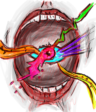
what u say for this sig? its flow goes multiple direction.pl help.

Last edited by SOFT; 05-14-2011 at 10:06 AM.
-
I have largely come to disagree with a lot of things and generally agree with a lot of things, I am well aware of different styles of tags and each style incorporates many things but to limit a tag to just simplistic degree's is pointless.
Not everyones style will create a sense of depth, nor will it always create lighting or atmosphere. People are limited to what they like and what their style of creation is, it's fine to broaden your artistic stand point by trying to create a piece that will generally be accepted by the masses as a "good tag" but in the end the only true opinion that matters of your work is yours.
As far as flow goes, I can only see the flow of a tag when the things surrounding the focal pull me towards the focal, in my opinion thats what flow should be, it should be creating a flow that pulls your eyes directly to what you need to be looking at.
Honestly Soft this is one of your better pieces, the flow is only off because instead of me being pulled into the focal the focal pulls me into the background.
-
instead of me being pulled into the focal the focal pulls me into the background...
yes j dragon u teach me a vital thing of sig...
any way i got a little thing about flow that flow should not intersect but should be same but parelell or outward or inward from or to focal but should not intersect.this is may not sufficient about flow but can somebody may bonafied of this.
PL DO NOT CONCENTRATE ON SIGNATURE ORG FLOW BUT FOLLOW THE DIRECTIONAL ST. LINES IS AS FLOWS DIRECTION AND IT MAY BE ONWARDS OR REVERSE


this below is wrong flow because here flows intersect together----->

Last edited by SOFT; 05-14-2011 at 12:35 PM.
-
 Posting Permissions
- You may not post new threads
- You may not post replies
- You may not post attachments
- You may not edit your posts
-
Forum Rules
|


 Reply With Quote