0 members and 4,007 guests
No Members online

» Site Navigation

» Stats
Members: 35,443
Threads: 103,072
Posts: 826,684
Top Poster: cc.RadillacVIII (7,429)
|
-
 Anime + Ninja Anime + Ninja
i haven't made a signature in so long, my brother helped me out a bit, i like it tbh (:

i'm not going to lie, my brother helped me out A LOT with this one

Cnc  ? ?
Last edited by xProphecy; 06-04-2011 at 07:09 PM.
-
Yeah I know, the second one I basically did for you :}
-
-
 Originally Posted by Elipse

you guys are brothers?
yeah unfortunately lol  . .
-
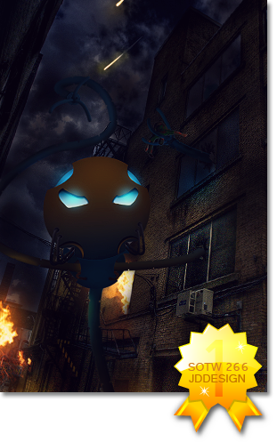
Pretty good, but you can tell the big differences in the two sigs. The text in the first one needs to be refined. I usually hate huge text but if you worked on blending it and not over effecting it to where you can't see half of it then this might actually look cool.
Your bro's version would be a good example of blending the text and not over-effecting.  Good job, kiu. Good job, kiu.
-
Originally Posted by JDdesign
Pretty good, but you can tell the big differences in the two sigs. The text in the first one needs to be refined. I usually hate huge text but if you worked on blending it and not over effecting it to where you can't see half of it then this might actually look cool.
Your bro's version would be a good example of blending the text and not over-effecting. Good job, kiu.
Yup.
As for proper criticism. He's right, don't add text + work on your lighting and try to make it appeal more.
-
-
Originally Posted by Elipse
Age differences?
2 years, im 13, he's 15.
-
now.. where do you guys live.
-
Lmfao^.
Hai Prophecy . I like both of them, especially the second no offense xD. The text I like though. Parts of both renders look kinda lq to me though.
Similar Threads
-
By cC.Agitator in forum Sigs & Manips
Replies: 13
Last Post: 04-21-2011, 09:15 PM
-
By niproction in forum Sigs & Manips
Replies: 9
Last Post: 04-14-2011, 08:44 PM
-
By oNo in forum Sigs & Manips
Replies: 4
Last Post: 01-11-2011, 11:45 PM
-
By PP Bone in forum Sigs & Manips
Replies: 12
Last Post: 07-14-2005, 12:52 AM
 Posting Permissions
- You may not post new threads
- You may not post replies
- You may not post attachments
- You may not edit your posts
-
Forum Rules
|


 Reply With Quote