GFXVoid Graphic Design Forum

Remove Text Formatting
Loading...

» Online Users: 2,263

0 members and 2,263 guests
No Members online

» Site Navigation

 > FAQ

» Stats

Members: 35,443
Threads: 103,072
Posts: 826,684
Top Poster: cc.RadillacVIII (7,429)
Welcome to our newest member, Lekelindids
Results 1 to 2 of 2
  1. #1
    Join Date
    Sep 2010
    Location
    sheffield , england
    Posts
    108

    Default World of Warcraft Sig - LFC908


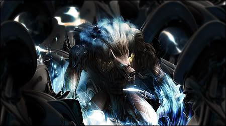
    well this is my second sig after my few month break. It's better than my first attempt

    C&C

    *is it missing contrast or vibrance?

  2. #2
    Join Date
    Jan 2009
    Location
    Myrtle Beach
    Posts
    157

    Default

    I like it! Great depth, the only thing that's a little off for me is the lighting on the front graphics. It sort of breaks up the flow? I know the focus is the creature in the middle but I feel there should also be a natural flow of the light. Good job! KIU

Similar Threads

  1. World Of Warcraft
    By Bogui in forum Sigs & Manips
    Replies: 2
    Last Post: 05-31-2010, 12:28 AM
  2. World Of Warcraft
    By SaTe in forum Sigs & Manips
    Replies: 4
    Last Post: 07-25-2009, 09:32 PM
  3. World of Warcraft, anyone?
    By Afterburn in forum The Void
    Replies: 18
    Last Post: 03-28-2006, 10:22 AM
  4. World of Warcraft
    By Adam in forum The Void
    Replies: 6
    Last Post: 07-09-2005, 06:18 PM

Posting Permissions

  • You may not post new threads
  • You may not post replies
  • You may not post attachments
  • You may not edit your posts
  •  
Powered by vBadvanced CMPS v4.1.1