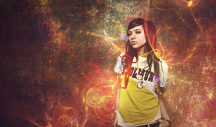
1st one needs some blending because the render looks not attched \:
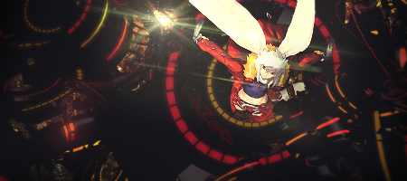
2nd is kinda cool but empty and some sharpen will help erase the parts that seems not attched and do some more buuble or something like that...
kiu bro its cool tags but looks like ones that are unfinished
1st one needs some blending because the render looks not attched \:
2nd is kinda cool but empty and some sharpen will help erase the parts that seems not attched and do some more buuble or something like that...
kiu bro its cool tags but looks like ones that are unfinished
1st one needs some blending because the render looks not attched \:
2nd is kinda cool but empty and some sharpen will help erase the parts that seems not attched and do some more buuble or something like that...
kiu bro its cool tags but looks like ones that are unfinished
oh hello hyourin...well i think you know me hihi xD
so going to the topic...i really like the compo on the 1st one..but maybe you can somewhat improve the depth here...but i really like it lol
on the 2nd one..maybe sharpening would make it better..the fractal thing looks bluurrred and lq


 Reply With Quote


