0 members and 695 guests
No Members online

» Site Navigation

» Stats
Members: 35,443
Threads: 103,072
Posts: 826,684
Top Poster: cc.RadillacVIII (7,429)
|
-
-

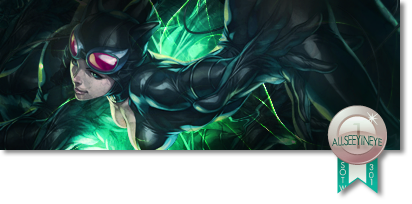
when i saw the name of this topic i thought at first u posted int he wrong section like u asking about people flaming on cnc :P well as i can see here your tag is flat u need to try bring in some depth and maybe some darker colors to bring your focal out more .
make a v2 on making it darker and i will give u some more cnc bro . gl and ttyl .
-
I don't like the pink you have over the render/background below the flames. It's also a bit bright and the focal should be brought out a bit more. Points for concept though. Keep it up 
-
Made a V2 with Sirenzo's tips 
First SOTW win (301)

Gift from my secret backup santa Oath ^ <3
Gifts <-- clickie
-
The seccond version is defnicaly better
I love the effects, but like sirenzo said it needet some contrast.
I would remove the text to and add a smaller border
And as said, try to bring out the focal of the render more,
I think you are doing well man. u getting better evry time i see a tag of you 
-
v1 is very washed out
Don't go for that look.. ever :P
v2 is much better
Althought the right side where the render is still looks washed out
IDK if this'll work or not but get a curves layer and use a black brush and brush over everything except for the right hand side on the curves layer.
You are now free to mess around and try get a more pleasing, less washed out look.
Or... if you did something like brushing white over the render or something you can just get rid of it that way :P
Text should just go IMO
Doesn't add anything to the signature in a good way.
Due to the white look on the left, the lighting is off.
If you can rid of the washed out look for the right hand side than helping your lighting will be much easier
I'd darken the left a bit more
So really I know from what I said it looks like you did bad but you didn't haha
I see that you have got here some really nice blending and flow as well as some pretty decent depth.
It really is just the washed out look that drags it down as well as the text
Apart from that it's just little nitpicks
So I do see improvement bro so KIU XD
-
-
The second version is definitely better but the BIGGEST problem here is your lighting.
First off, avoid lighting coming from the side, it does not look natural or right and therefore loses the appeal of the tag. Try to get it from behind or the corners. Below could work out some times but it seems hard to do lighting below and execute it right.
Not to be rude, but you basically just soft brushed the right, DON'T DO THAT !
Try to create your lighting based on your allignment of effects and adjustments used.
Burn/dodge areas to correct it.
The typography could also go because it is very distracting.
It also needs stronger colors, which I believe with proper lighting would help that.
Kiu !
-
the background and the renders seems like they are on the same layer..
the white thing over the render is distracting because it made here look lqish and flat
dont use text like that because it distracts the overalll tag..and yea sure v2 is better but still its not enough add more depth and lighting effects onto it by adding a general lighting and some objects to give emphasis to the depth
 ^thanks for the epic gift AGITATOR!
-
it's looking better do you have team viewer maybe u and i can work on that a bit see if we can fix it even more m8 . add me to msn my email is on my profile or just pm me and i'll send u it.
Similar Threads
-
By chonfat in forum Sigs & Manips
Replies: 5
Last Post: 01-26-2011, 09:37 PM
-
By ~FireTap in forum Digital Art
Replies: 7
Last Post: 02-13-2008, 01:39 PM
-
By Elektrik in forum Digital Art
Replies: 5
Last Post: 12-31-2005, 01:27 PM
-
By Spid3r in forum Digital Art
Replies: 6
Last Post: 10-30-2005, 08:54 AM
-
By sneaky in forum Digital Art
Replies: 3
Last Post: 07-31-2005, 04:57 PM
 Posting Permissions
- You may not post new threads
- You may not post replies
- You may not post attachments
- You may not edit your posts
-
Forum Rules
|


 Reply With Quote


