GFXVoid Graphic Design Forum

Remove Text Formatting
Loading...

» Online Users: 1,788

0 members and 1,788 guests
No Members online

» Site Navigation

 > FAQ

» Stats

Members: 35,443
Threads: 103,072
Posts: 826,684
Top Poster: cc.RadillacVIII (7,429)
Welcome to our newest member, Lekelindids
Results 1 to 8 of 8

Thread: Green Lantern

  1. #1
    Join Date
    Dec 2010
    Posts
    971

    Default Green Lantern

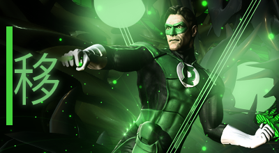
    Okay well my first sig with the void was a green lantern sig, and my newest sig is a green lantern sig so i figured it would be cool if i did a before and after CnC my newest sig please

    My first sig -


    My latest -
  2. #2
    Join Date
    May 2010
    Posts
    1,942

    Default

    Great improvement and I can see you're picking up on Josh's style.

    One thing is that you need to blend in your renders and make your typography less distracting.
    At the moment the render is sticking out a bit too much and the typo could use work.
    Try adding more detail to this to help the appeal and depth. It looks a lot better though man, kiu :}.


    My gift wall!
    My gift wall #2!
    My Genesis Tag Tutorial, check it out here!
    My Halo Tag Tutorial, check it out here!


  3. #3

    Default CnC

    Well first of all i can say from seeing your first signature and latest that you are improving. Now time for some CnC.

    Well first thing i think which can be improved is color. Well you see there is green color more in whole tag which is making a tag bit monotone. Try to add a secondary color along with green. Maybe red or orange. Now the text you can move the text near to the focal as the text is distracting the focal. The render needs blending which can be done through filters and adjustments like gmaps and photo-filters. And yeah darken the right bottom side. You see the hand there and the c4d darken that part. Overall good improvement just some tweeks needed to make it more better.KIU.

  4. #4
    Join Date
    Dec 2010
    Posts
    971

    Default

    Thanks guys, and yes i love josh's style, i hope he doesnt mind, and shann thanks for the tips, its been a long time since someone has given me good long CnC like that

  5. #5

    Default

    Haha if you need help and don't understand anything or stuck than feel free to contact me.

  6. #6

    Default

    looks good bro...just give more emphasis to the lighting by making the circles more vibrant and darkening some spots..
    btw the japanese text doesnt match the focal


    ^thanks for the epic gift AGITATOR!

    SOTW:261|265|288|308 |edwinpabito.deviantart.com


  7. #7
    Join Date
    Dec 2010
    Posts
    971

    Default

    Quote Originally Posted by edwinpabito View Post
    looks good bro...just give more emphasis to the lighting by making the circles more vibrant and darkening some spots..
    btw the japanese text doesnt match the focal
    How would i give more emphasis to the circles? Like waht techniques would i use? And noooooooo!!!!! I <3 the japanese text, i guess i will remove

  8. #8

    Default

    The asian text and C4D in the right corner don't fit. Nice lighting and good progression.

Similar Threads

  1. Green Lantern Cnc
    By Muffin in forum Sigs & Manips
    Replies: 10
    Last Post: 03-22-2011, 10:46 AM
  2. Green Lantern
    By Derosion in forum Sigs & Manips
    Replies: 4
    Last Post: 11-02-2010, 08:14 PM
  3. green lantern
    By Xelo in forum Sigs & Manips
    Replies: 4
    Last Post: 10-01-2010, 01:55 PM
  4. Green Lantern
    By Mr. H in forum Sigs & Manips
    Replies: 7
    Last Post: 08-30-2010, 04:38 AM
  5. Green Lantern
    By +s9.Oath in forum Sigs & Manips
    Replies: 6
    Last Post: 08-13-2009, 02:26 PM

Posting Permissions

  • You may not post new threads
  • You may not post replies
  • You may not post attachments
  • You may not edit your posts
  •  
Powered by vBadvanced CMPS v4.1.1