0 members and 1,226 guests
No Members online

» Site Navigation

» Stats
Members: 35,443
Threads: 103,072
Posts: 826,684
Top Poster: cc.RadillacVIII (7,429)
|
-
 Robo soldier Cnc Robo soldier Cnc
Made a new one, its B&W:

Cnc plz
First SOTW win (301)

Gift from my secret backup santa Oath ^ <3
Gifts <-- clickie
-
First SOTW win (301)
Gift from my secret backup santa Oath ^ <3
Gifts <-- clickie
-
CnC
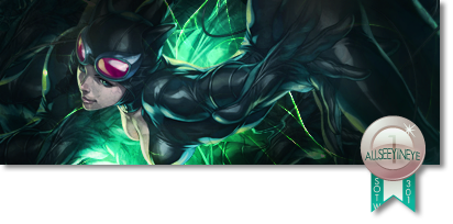
Hm, looks like a book cover more than a signature so it's pretty cool :].
The lighting brush you used makes it look washed out, those brushes under the text look too sloppy and the text is lump sided. The tag it self isn't bad but it looks extremely plain, you want to make it look different than a stock made Black and white.
Remember that text can either make or kill a signature.
To improve it I would suggest moving the render a bit to the right side, remove the text, use 3-4 black and white gradients set on luminosity 100%, remove the boarder and sharpen up the render but leave the back blurred.
GL
Like this CnC? +Rep ^_^, I'm in a race again'st Slave and Apathy.
Last edited by Synsational; 06-23-2011 at 12:29 PM.
-
Looks too washed out, bump up the contrast, Pen tool effect looks out of place, add more of it or get rid of it. Text is poor, remove or improve.
-
 Originally Posted by Syn

Hm, looks like a book cover more than a signature so it's pretty cool :].
The lighting brush you used makes it look washed out, those brushes under the text look too sloppy and the text is lump sided. The tag it self isn't bad but it looks extremely plain, you want to make it look different than a stock made Black and white.
Remember that text can either make or kill a signature.
To improve it I would suggest moving the render a bit to the right side, remove the text, use 3-4 black and white gradients set on luminosity 100%, remove the boarder and sharpen up the render but leave the back blurred.
GL
Like this CnC? +Rep ^_^, I'm in a race again'st Slave and Apathy.
Thx dude, I will pay attention to those things next time 
im srry, but I can't give you rep, as my last rep also went to you 
First SOTW win (301)
Gift from my secret backup santa Oath ^ <3
Gifts <-- clickie
-
-
Ditto to the others, it's not too bad, but lacking some depth
Proud owner of the "50 Shades of Syn" series

-
Similar Threads
-
By exclusive in forum Sigs & Manips
Replies: 6
Last Post: 02-26-2011, 11:53 AM
-
By -VD.ASD in forum Sigs & Manips
Replies: 2
Last Post: 09-30-2010, 08:10 AM
-
By Ravon in forum Sigs & Manips
Replies: 2
Last Post: 02-14-2006, 04:05 PM
-
By Lumix in forum The Void
Replies: 9
Last Post: 08-18-2005, 05:28 AM
-
By Link-lemonade in forum The Void
Replies: 0
Last Post: 06-24-2005, 02:39 PM
 Posting Permissions
- You may not post new threads
- You may not post replies
- You may not post attachments
- You may not edit your posts
-
Forum Rules
|


 Reply With Quote


 It's all good my man, no problem
