0 members and 4,922 guests
No Members online

» Site Navigation

» Stats
Members: 35,443
Threads: 103,072
Posts: 826,684
Top Poster: cc.RadillacVIII (7,429)
|
-
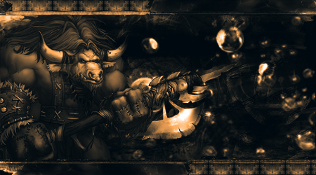
 Tauren Tauren
Sorry I haven't made anything in a while. My power has been out due to storms so I just got it back. Anyways here is my latest, please CnC.
 Originally Posted by JDdesign
Trying to be different by makin a sig with puke ugly colors doesn't make u a new breed; it just makes u color blind 
Originally Posted by Syn
No problem my man, helping others is how I make up for masturbating to tranny porn. Makes me feel a bit less gay.
-
CnC
Well the tag is good. I like the render placement and that border. need some tweeks to make it more better. The things which need to be done is color and composition. Well you see the tag is monotone at the moment means only one color is there that yellow everywhere. Tag is not good if its monotone. Try adding a secondary color in the tag something like orange or so. After adding other color do some color adjustments like selective color,color balance and if you knoww than channel mixer. Now comes composition. You see you added bubble c4d on right side or whatever it is but there you see they are some negative place means black which is not good. Do some lighting there. Light the bubbles and fill the space. Like light coming from the axe end to bubbles. Don't overdo it. Remember add things in the tag only if it looks good. KIU.
If you need any help than feel free to contact me.
-
Originally Posted by Shann

Well the tag is good. I like the render placement and that border. need some tweeks to make it more better. The things which need to be done is color and composition. Well you see the tag is monotone at the moment means only one color is there that yellow everywhere. Tag is not good if its monotone. Try adding a secondary color in the tag something like orange or so. After adding other color do some color adjustments like selective color,color balance and if you knoww than channel mixer. Now comes composition. You see you added bubble c4d on right side or whatever it is but there you see they are some negative place means black which is not good. Do some lighting there. Light the bubbles and fill the space. Like light coming from the axe end to bubbles. Don't overdo it. Remember add things in the tag only if it looks good. KIU.
If you need any help than feel free to contact me.
Monotoned signatures seem to be coming back. when I first started design, (mid 2000s) monotoned tags were everwhere. Then someone decided monotoned = bad. But lately I've seen a lot more of them coming back lately. I don't think it's a bad thing necessarily. As for your signature, I really like the composition for the most part. Everything is blended extremely well and your border is very creative to say the least. Like what was mentioned above, some lighting would help you out immensely. I would also consider moving the render over to the right a bit and center it out. It would get rid of a lot of negative space you have. I'm a fan of this tag. Keep at it.
-
See monotone is a thing which looks good if its done in a good way. In this tag if he add one more color it would look lot better. If you do one color like blue do it in that way like light blue,blue than dark blue which goes good.

In same way he can do light yellow,yellow and dark yellow. You see monotone things looks good in c4d tags or abstract art i agree.But when this focal or render thing is done it kinda becomes boring.
-
I do really like the border, but it's a tad too dark imo.

Psalms 150
-
Heres v2 and v3. Let me know what you all think. Sorry it took so long, my power went out again...
V2:

V3:

Originally Posted by JDdesign
Trying to be different by makin a sig with puke ugly colors doesn't make u a new breed; it just makes u color blind
Originally Posted by Syn
No problem my man, helping others is how I make up for masturbating to tranny porn. Makes me feel a bit less gay.
-
v2 is a lot better, v3 looks too orange.
Blur the bubbles a little bit inmho...
-
id like to see some red in there also im not sure if the render should be so far on the left?
a way of making it right is by splitting your canvas into thirds, then place the render on one of those lines you split it up in
Similar Threads
-
By Tryne in forum Sigs & Manips
Replies: 8
Last Post: 10-28-2010, 08:09 AM
-
By theclan10 in forum Sigs & Manips
Replies: 10
Last Post: 05-15-2009, 05:06 AM
 Posting Permissions
- You may not post new threads
- You may not post replies
- You may not post attachments
- You may not edit your posts
-
Forum Rules
|


 Reply With Quote


