0 members and 517 guests
No Members online

» Site Navigation

» Stats
Members: 35,443
Threads: 103,072
Posts: 826,684
Top Poster: cc.RadillacVIII (7,429)
|
-
-

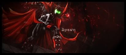
It's a little dark, but besides that I like it. Seems a little simple though.

Psalms 150
-
-
CnC
 Originally Posted by LilBasedGod

Nice little tag you got here, very nice way to maintain a solid color without monotoning the tag itself.
Watch your render size next time, though. Small renders tend to not look as good as bigger sized ones because one can never really tell what is going on. With a smaller render you have to add more to the edges and corners because it leaves that much more space for you to work with.
One important thing with dark signatures like this one, you need to add a light source because without it the tag looks like a resized wallpaper and thought that's a good thing it can also be a negative thing when it has "signature" effects.
I would suggest for you to try and use different shades of red when adding effects, though. Even though it doesn't really look monotoned at all, it kind of just looks red and black with a small touch of green (eyes). With different shades you can add levels to a tag which will either make or kill a tag.
GL, KIU
Similar Threads
-
By Akali in forum Sigs & Manips
Replies: 2
Last Post: 09-30-2010, 09:23 PM
-
By Studhorse in forum Sigs & Manips
Replies: 4
Last Post: 06-07-2008, 09:44 AM
-
By EchoZ in forum Sigs & Manips
Replies: 7
Last Post: 07-12-2005, 07:43 AM
-
By nelo in forum Sigs & Manips
Replies: 9
Last Post: 07-10-2005, 10:06 PM
-
By xProphet in forum Digital Art
Replies: 8
Last Post: 07-04-2005, 10:16 AM
 Posting Permissions
- You may not post new threads
- You may not post replies
- You may not post attachments
- You may not edit your posts
-
Forum Rules
|


 Reply With Quote
