0 members and 1,810 guests
No Members online

» Site Navigation

» Stats
Members: 35,443
Threads: 103,072
Posts: 826,684
Top Poster: cc.RadillacVIII (7,429)
|
-
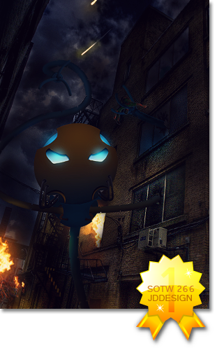
 Prince of Persia Prince of Persia
Hey all, its Theo again. Here is my latest, so let me know what you think.
Please CnC

 Originally Posted by JDdesign
Trying to be different by makin a sig with puke ugly colors doesn't make u a new breed; it just makes u color blind 
Originally Posted by Syn
No problem my man, helping others is how I make up for masturbating to tranny porn. Makes me feel a bit less gay.
-
-
Thanks rexy! Anybody else have any thoughts?
Originally Posted by JDdesign
Trying to be different by makin a sig with puke ugly colors doesn't make u a new breed; it just makes u color blind
Originally Posted by Syn
No problem my man, helping others is how I make up for masturbating to tranny porn. Makes me feel a bit less gay.
-
First thing i would say is the render is too sharp. Oversharpening can cause the render to look lq. Second thing is your colors clash with each other. It's good to have contrast such as orange and blue but you have a bright blue knife on top of an all orange bg with a bright red sash and the orange doesn't really blend well with the other 2.
I would say lower the sharpening and then use some gradient maps like dark blue to bright orange and orange to fuschia to bring the colors together. Also, try keeping the colors of the render and background present in your sig as much as possible. Just enhance them with your own highlights.
Make sure your effects like over the knife don't draw your attention away from the focal which in this case should be the face. Try to create a light source using the light that is already present on the render. Hope this helps, kiu. 
Last edited by JDdesign; 07-02-2011 at 09:51 PM.
-
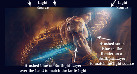
Here is v2. Let me know what you think!

Originally Posted by JDdesign
Trying to be different by makin a sig with puke ugly colors doesn't make u a new breed; it just makes u color blind
Originally Posted by Syn
No problem my man, helping others is how I make up for masturbating to tranny porn. Makes me feel a bit less gay.
-
I didn't do much to it. I just wanted to give u an idea of what i was talking about. A light source is important when working with character sigs to draw attention to the area of light that the original artist drew on the character. You'll notice i used a blue light source at the top right instead of orange. I did this to break up the heavy amount of orange from the background and the render.
I also used a few gradient maps to blend the colors together and also make the colors more saturated and vibrant. A typical gradient you'll get used to using is fuchsia to orange, but you'll soon be making gradients on your own to match the color and style of your sigs.
Here's the psd also so you can see what gradients and adjustments i added: http://www.mediafire.com/?tlfsuyw2haavjfh
Hope this helps. 
Last edited by JDdesign; 07-03-2011 at 02:05 AM.
-
Está bien, pero potencia a luz azul en el render y dale más ilu :3
-
Whoa, thanks a ton JD. That was supper helpful and it gave my tag the extra touches that it needed. Now I finally understand lighting! Thanks a ton, and here is my v3.

Originally Posted by JDdesign
Trying to be different by makin a sig with puke ugly colors doesn't make u a new breed; it just makes u color blind
Originally Posted by Syn
No problem my man, helping others is how I make up for masturbating to tranny porn. Makes me feel a bit less gay.
-
Originally Posted by JDdesign

I didn't do much to it. I just wanted to give u an idea of what i was talking about. A light source is important when working with character sigs to draw attention to the area of light that the original artist drew on the character. You'll notice i used a blue light source at the top right instead of orange. I did this to break up the heavy amount of orange from the background and the render.
I also used a few gradient maps to blend the colors together and also make the colors more saturated and vibrant. A typical gradient you'll get used to using is fuchsia to orange, but you'll soon be making gradients on your own to match the color and style of your sigs.
Here's the psd also so you can see what gradients and adjustments i added: http://www.mediafire.com/?tlfsuyw2haavjfh
Hope this helps.
this one is the coolest...and try to make it less soft
 ^thanks for the epic gift AGITATOR!
-
Originally Posted by Theo626
Whoa, thanks a ton JD. That was supper helpful and it gave my tag the extra touches that it needed. Now I finally understand lighting! Thanks a ton, and here is my v3.
I'm glad i could help ya. Your very welcome.
Similar Threads
-
By Highfly in forum Sigs & Manips
Replies: 2
Last Post: 01-13-2011, 06:18 PM
-
By Derosion in forum Sigs & Manips
Replies: 6
Last Post: 08-10-2010, 12:33 AM
-
By Reverse in forum Sigs & Manips
Replies: 5
Last Post: 11-10-2008, 11:54 AM
-
By Lew in forum Sigs & Manips
Replies: 10
Last Post: 10-10-2008, 11:17 AM
-
By zole in forum Sigs & Manips
Replies: 6
Last Post: 08-07-2008, 09:07 AM
 Posting Permissions
- You may not post new threads
- You may not post replies
- You may not post attachments
- You may not edit your posts
-
Forum Rules
|


 Reply With Quote