0 members and 2,139 guests
No Members online

» Site Navigation

» Stats

Members: 35,443
Threads: 103,072
Posts: 826,684
Top Poster: cc.RadillacVIII (7,429)
|
-
 How They Met How They Met
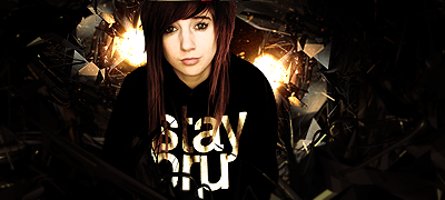
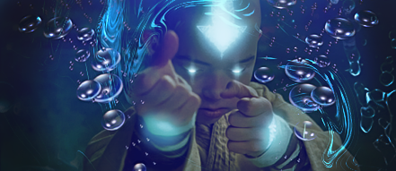
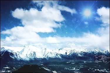
just trying new things... this started out working on Bokeh effects and ended up like this... LOL


Last edited by ascheb; 07-03-2011 at 07:32 PM.
-

i like v3 actually, the thing bothers me is the blurry clip mask in the left, i like this v more because it has some light to it, tho there could be more,
use dodge tool and burn tool to create some light and depth in same time in it 
really like the colours, intresting work, keep it up!
-

oh... thank you Linda!!! Your CnC is very encouraging and I appreciate that  I have been doing some tutorials on color quality and better smudging to learn more about how I can get vibrancy!!! I have been doing some tutorials on color quality and better smudging to learn more about how I can get vibrancy!!! 
-

Yah v3 is shexi loving the colors
 Pure sexyness from Ascheb <3

-

V3 looks the greatest to me, but I believe it's still lacking. I'd try adding some lighting in a few areas of the smudge to really give it that pop.
I'd also tone down the motion blur or wind you used, it seems a bit intense.
Nice man, just needs a better wow factor  ! !
-

thanks  Yes... wow factor is what i am presently working ON! =) Its what i think is really missing from my stuff :/ Yes... wow factor is what i am presently working ON! =) Its what i think is really missing from my stuff :/
-

i have to agree v3 is defiantly your better one out of all these the usage of colors was very well thought out and they stand out pretty good m8 . one thing im not liking right now would be the boarder u have ? or just this silver bar down the left side over here i think that was useless and would re move that to see how looks with out it .
-

V3, Now that offset isn't working great with the minimalistic composition. Also i would suggest getting more focus on the center part, a little offset lighting will be beaautiful. Adjust the vibrance(CS4 and above) to get better contrast, or you can just play with the curves. Try shades of gray. Color with gray is the most amazing thing i have ever seen in my artist life. It goes along like adam and eve. And in almost 80% cases its successful combination. Gray your edges. Add a small soft brush specle in the middle, give it outer glow and adjust its position behind the bigger globe(or w/e). Get in some more details. Dodge/burn wont really help because of the saturated colors being in higher, but you can always increase exposure.
Fur's Gift BOOOO EVERYONE

-
-

Yeah definitely V3, gj man 
 Posting Permissions
- You may not post new threads
- You may not post replies
- You may not post attachments
- You may not edit your posts
-
Forum Rules
|


