GFXVoid Graphic Design Forum

Remove Text Formatting
Loading...

» Online Users: 3,380

0 members and 3,380 guests
No Members online

» Site Navigation

 > FAQ

» Stats

Members: 35,443
Threads: 103,072
Posts: 826,684
Top Poster: cc.RadillacVIII (7,429)
Welcome to our newest member, Lekelindids
Results 1 to 2 of 2

Thread: Rebellion

  1. #1
    Join Date
    Jun 2010
    Posts
    41

    Default Rebellion


    v2
    Last edited by rebreb23; 07-05-2011 at 12:58 AM.


  2. #2
    Join Date
    Nov 2010
    Location
    Tennessee
    Posts
    353

    Default

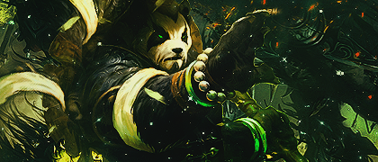
    Nice work! I just got a few points to make. First off, I would just like to say that the colors and the flow of this tag are really good. The blur on the background gives the tag the needed depth. If anything is wrong with this tag it would be the text.Im not sure why the first 3 letters of rebellion are capitalized, it just looks odd. I may have missed some stuff because I am tired from lighting fireworks and everything is still really bright because on went off right infront of me a minute ago.
    ^^ Awesome Gift by Xelo ^^
    Gifts: lewk <3 | Xelo <3 |

    Quote Originally Posted by JDdesign
    Trying to be different by makin a sig with puke ugly colors doesn't make u a new breed; it just makes u color blind
    Quote Originally Posted by Syn
    No problem my man, helping others is how I make up for masturbating to tranny porn. Makes me feel a bit less gay.

Similar Threads

  1. [Video] Rebellion Full Signature
    By Push in forum Other Tutorials
    Replies: 13
    Last Post: 12-30-2005, 07:12 AM

Posting Permissions

  • You may not post new threads
  • You may not post replies
  • You may not post attachments
  • You may not edit your posts
  •  
Powered by vBadvanced CMPS v4.1.1