GFXVoid Graphic Design Forum

Remove Text Formatting
Loading...

» Online Users: 5,883

0 members and 5,883 guests
No Members online

» Site Navigation

 > FAQ

» Stats

Members: 35,443
Threads: 103,072
Posts: 826,684
Top Poster: cc.RadillacVIII (7,429)
Welcome to our newest member, Lekelindids
Results 1 to 4 of 4
  1. #1
    Join Date
    Mar 2005
    Location
    Georgia,USA
    Posts
    4,752

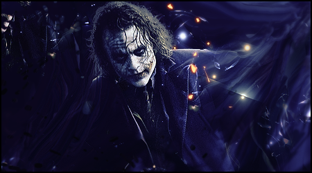
    Default wrftw and +ta.Oath Collab

    I started


    he did this


    then i did this


  2. #2
    Gaaf's Avatar
    Gaaf is offline Fight Club is closed..

    Super Moderator

    Join Date
    Aug 2010
    Location
    Netherlands
    Posts
    2,223

    Default

    I like the seccond version the most
    I do feel like some bubbles shouldnt be there trough..

  3. #3

    Default

    the flow seems a little off... otherwise this I think this is awesome... love them collabs!


    Thanks RememberMe <3 WOOT

    awesome gift from G.. Thx so much


  4. #4
    Join Date
    Dec 2009
    Location
    Netherlands
    Posts
    1,412

    Default

    Could be me but I'm not really feeling this one, it seems to me as if the artists both had completely different things in mind.

    Oath starts out with a smudge that gives the tag flow, the main thing I notice here is that the hair is either cut out badly or there's smudging behind it which, like the rest of the render, gives the impression that there's light coming from behind the joker, which is not visible in the background.

    In wr's version the smudge is somewhat blocked from view by foreground effects, which give it depth and blends the left nicely but lead me to the earlier mentioned conclusion that both artists had different things in mind. The lights added here don't do it for me, a subtle bokeh had perhaps worked for me but this seems too sharp and apparant. Also the lights don't seem to emit (?) light onto their surroundings.

    In the final version the big lights that were bothering me are removed, but so are the depth creating foreground effects. The remaining lights/sparks help make it less monotone but seem out of place.

    Don't get me wrong, although I'm being really negative I wouldn't dare imply this is bad, just not my thing.
    The main reason I notice these things is because I'm a big fan of your individual works! Keep it up!

Similar Threads

  1. Oath Pack
    By +s9.Oath in forum Resources
    Replies: 4
    Last Post: 06-20-2011, 12:52 PM
  2. Oath
    By cc.mio in forum Sigs & Manips
    Replies: 5
    Last Post: 06-06-2011, 02:42 AM
  3. Oath vs. gaafjeah
    By cc.RadillacVIII in forum Member Battles Voting
    Replies: 14
    Last Post: 05-31-2011, 08:34 AM
  4. New Baby Oath !!!
    By +s9.Oath in forum The Void
    Replies: 30
    Last Post: 01-01-2011, 03:15 PM

Posting Permissions

  • You may not post new threads
  • You may not post replies
  • You may not post attachments
  • You may not edit your posts
  •  
Powered by vBadvanced CMPS v4.1.1