Where the windows are red, and the grass is mighty green
Posts
276
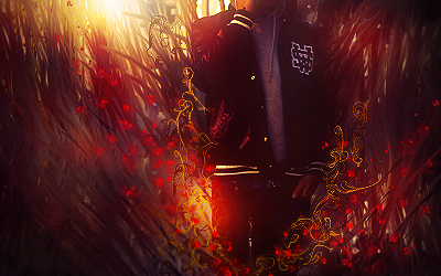
Looks like some hardbrush smudging am I right? I think the top half of the smudge looks very nice, the lower part doesn't. The top part has some nice depth too it cos of the diff. colors and such, the lower just looks flat with all that grey. Make the lower like the top smudge and it'll look fine imo.
The bokehs look kinda randomly placed tbh, i'd just remove them altogether. I do like the effects around the dude, altough some of the parts around his leg look to obv. soft-brush-erased (lol what word ^^) imo.
With a few fixes this could be rly nice I think! kiu
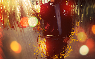
Everything looks good, the style of the tag again is a vision.
I would just tell you to clean up or color the bottom smudge strokes because they don't blend at all with the picture and reduce your color flare circles because they kill the focal.


 Reply With Quote