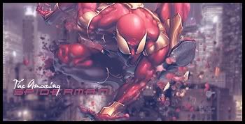
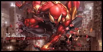
GFXVoid Graphic Design Forum

Remove Text Formatting
Loading...

» Online Users: 1,621

0 members and 1,621 guests
No Members online

» Site Navigation

 > FAQ

» Stats

Members: 35,443
Threads: 103,072
Posts: 826,684
Top Poster: cc.RadillacVIII (7,429)
Welcome to our newest member, Lekelindids
Results 1 to 3 of 3
  1. #1
    Join Date
    Jun 2011
    Posts
    24

    Default The Amazing Spiderman


    CnC
    Last edited by JosephWalker; 07-30-2011 at 03:04 PM. Reason: added a lil more to it

  2. #2
    Join Date
    Jul 2009
    Location
    Brooklyn, New York
    Posts
    1,604

    Default

    Top one is better in my opinion. The text is off imo. You should also, work on the foreground a bit maybe some splatters with clipping masks. Otherwise, they're pretty decent.

    My Three Rules Of Making a Sig Flow, Lighting and Depth


  3. #3
    Join Date
    May 2011
    Posts
    23

    Default

    It looks like Ironman...
    I am Lazy and i do masking therefore i am LAZYMASK

Similar Threads

  1. Replies: 68
    Last Post: 09-19-2011, 11:37 PM
  2. The Amazing Spiderman
    By Indestructible in forum Sigs & Manips
    Replies: 3
    Last Post: 05-04-2011, 07:23 AM
  3. Amazing Spiderman
    By cc.mio in forum Sigs & Manips
    Replies: 19
    Last Post: 01-26-2011, 12:48 PM
  4. al the amazing
    By xDMXx in forum Digital Art
    Replies: 3
    Last Post: 09-19-2007, 04:35 PM

Posting Permissions

  • You may not post new threads
  • You may not post replies
  • You may not post attachments
  • You may not edit your posts
  •  
Powered by vBadvanced CMPS v4.1.1