0 members and 1,207 guests
No Members online

» Site Navigation

» Stats
Members: 35,443
Threads: 103,072
Posts: 826,684
Top Poster: cc.RadillacVIII (7,429)
|
-
 Updated too human sig, versions 2 and 3 Updated too human sig, versions 2 and 3
My newest sig work  Before I start, These were supposed to be simplistic, but there was tons of level work that went into bringing out the color just right on Baldorf or whatever his name is from Too Human. :P I will post the Too Human vbersion which, in my opinion, is the better one, and I will also post a similar, but worse, Halo one. I think that I need to make the render bigger on the Halo one and that I need to work on the colors a little more. CnC? Please be gentle... Before I start, These were supposed to be simplistic, but there was tons of level work that went into bringing out the color just right on Baldorf or whatever his name is from Too Human. :P I will post the Too Human vbersion which, in my opinion, is the better one, and I will also post a similar, but worse, Halo one. I think that I need to make the render bigger on the Halo one and that I need to work on the colors a little more. CnC? Please be gentle...
RENDER
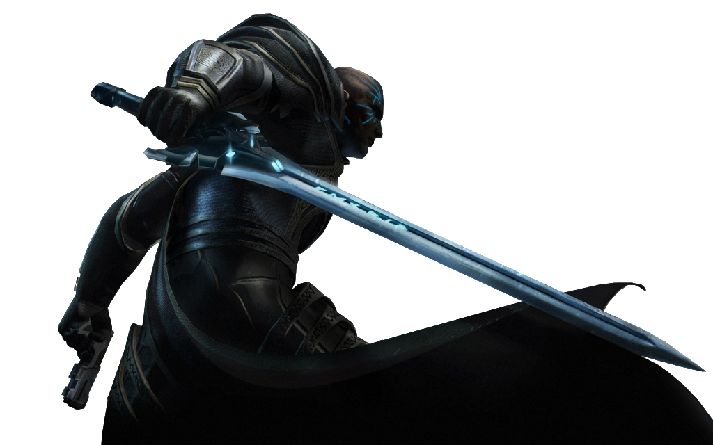
TOO HUMAN SIG

Too Human V2

Too Human V3

HALO: REACH SIG (its pretty bad :P)


Dark Method: fluff guy...weird name guy...ur all fucking weird and that's all i have to say about that
-
um cool renders, sigs themselves are basically renders w/text so there is not much to comment on. the placement of the renders is pretty good, the sizing of the renders is done ok not too stretched out. the text is ok, not the best text ever, but it gets the name across ok. I would suggest looking at other pple's sigs to see what all goes into making a signature besides adding the render and text in there. Kiu and try adding a background, effects, lighting, depth, etc.
-
-
You achieved what you wanted to achieve... but its really empty..
Well done on your contrast though.. just the right amount imo.
Similar Threads
-
By The Fluffy Goat in forum Sigs & Manips
Replies: 3
Last Post: 08-01-2011, 10:06 PM
-
By Dunway in forum Sigs & Manips
Replies: 6
Last Post: 07-21-2009, 11:57 PM
-
By AnseM2k in forum Sigs & Manips
Replies: 5
Last Post: 10-11-2008, 11:34 PM
-
By Adam in forum Sigs & Manips
Replies: 3
Last Post: 02-02-2006, 10:48 PM
-
By Scandium in forum Digital Art
Replies: 7
Last Post: 07-08-2005, 12:41 PM
 Posting Permissions
- You may not post new threads
- You may not post replies
- You may not post attachments
- You may not edit your posts
-
Forum Rules
|


 Reply With Quote

