0 members and 5,983 guests
No Members online

» Site Navigation

» Stats
Members: 35,443
Threads: 103,072
Posts: 826,684
Top Poster: cc.RadillacVIII (7,429)
|
-
 kuchiyose kuchiyose
-
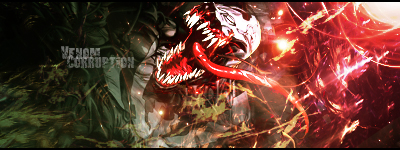
Really nice sig you got there. However, I feel like the effects are overpowering the focal rather than complimenting it. I feel as if I looking more to the left side of the sig rather than the right. But that seems to happen in the 1st version opposed to the second. Otherwise great sig v2 imo.

My Three Rules Of Making a Sig Flow, Lighting and Depth
-
-
i like the 2nd one more, because of the grey thing. On first one it looks like you made it in one second and changed the colour, but in the 2nd one it fits really well.
I like the colours, and u have excelent flow ;]
Tho there is no much depth here, but im not sure about it,
i would only sharpen her face more in this one, its bit blurry, and add some burning, to create depth ;]
gjkiultnxbye
-
to obtain depth you might sharpen the face a bit as Linda said, and blur/smudge the bg....
good job and very nice siggy!!
From scratch, just smudging the XL way
-
-
v2 looks absolutely quality, really like the effects even if they do draw the eye a bit away from the focal point!
-
i agree sharpening the face would help. v2 is good, but i still like the color idea on v1. :]
 Posting Permissions
- You may not post new threads
- You may not post replies
- You may not post attachments
- You may not edit your posts
-
Forum Rules
|


 Reply With Quote