GFXVoid Graphic Design Forum

Remove Text Formatting
Loading...

» Online Users: 5,610

0 members and 5,610 guests
No Members online

» Site Navigation

 > FAQ

» Stats

Members: 35,443
Threads: 103,072
Posts: 826,684
Top Poster: cc.RadillacVIII (7,429)
Welcome to our newest member, Lekelindids
Results 1 to 10 of 10

Thread: Ent (Schultz)

  1. #1
    Join Date
    Jan 2010
    Posts
    2,599

    Default Ent (Schultz)

    V2: Just added a few tweaks


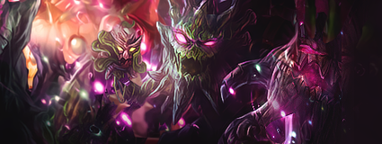
    Took me about an hour to finish this. I had fun playing around with colors and I really focused on its depth and lighting though I think the lower right part could have been better but I am still happy with my outcome. Looks a bit girly but thats just how i roll! CnC please
    EDIT: Oh and if you like it here is my DA acc http://schultz94.deviantart.com/art/Ent-255864779
    P
    lease +fav if you like what you see!
    Last edited by schultz; 08-30-2011 at 01:30 PM.
    I dont make sigs anymore

  2. #2
    Join Date
    Dec 2010
    Posts
    1,145

    Default

    i like everything but that front/bottom right thing part


  3. #3
    Join Date
    Jan 2010
    Posts
    2,599

    Default

    Took me a while to figure out how to remove it but here it is
    Last edited by schultz; 08-30-2011 at 02:39 PM.
    I dont make sigs anymore

  4. #4
    Join Date
    Dec 2010
    Posts
    1,145

    Default

    better


  5. #5
    Join Date
    Feb 2011
    Posts
    1,325

    Default

    v2 is better. needs better contrast imo. and looks way too smooth. also some of the bubbles or effects looks bad because you reduced opacity or erased them. especially at the right.

  6. #6
    Join Date
    Jan 2010
    Posts
    2,599

    Default

    ok heres another version

    i may have forgot about the contrast thing and i closed my ps so im just gonna work on it later.
    I dont make sigs anymore

  7. #7
    Join Date
    Jul 2008
    Location
    Leominster, Massachusettes
    Posts
    2,293

    Default

    On a serious note to prevent DM from having a coronary, I think you need to work on lighting and depth in this piece also the dark area just feels to fake to me.

  8. #8
    Join Date
    Jan 2010
    Posts
    2,599

    Default

    I think I will just re-do the whole tag if I have the time. Thanks for your comment.
    I dont make sigs anymore

  9. #9
    Join Date
    Mar 2010
    Location
    U.S
    Posts
    1,509

    Default

    v3 is pretty cool , if your using topaz though i would replace it with some old school sharpening
    M y r m i d o n s
    Midnight Marauders
    Plagues
    Kryptic Visons

    KOTH 19winStreak


  10. #10
    Gaaf's Avatar
    Gaaf is offline Fight Club is closed..

    Super Moderator

    Join Date
    Aug 2010
    Location
    Netherlands
    Posts
    2,223

    Default

    Where the fuck have you been?
    anyway on topic: Colors seem a bit dull to me, i like the concept and the idea.
    and like liquid said maybe sharpen this up a lill

Similar Threads

  1. To schultz
    By Reyn in forum Sigs & Manips
    Replies: 4
    Last Post: 04-03-2011, 01:13 PM

Tags for this Thread

Posting Permissions

  • You may not post new threads
  • You may not post replies
  • You may not post attachments
  • You may not edit your posts
  •  
Powered by vBadvanced CMPS v4.1.1