GFXVoid Graphic Design Forum

Remove Text Formatting
Loading...

» Online Users: 5,855

0 members and 5,855 guests
No Members online

» Site Navigation

 > FAQ

» Stats

Members: 35,443
Threads: 103,072
Posts: 826,684
Top Poster: cc.RadillacVIII (7,429)
Welcome to our newest member, Lekelindids
Page 1 of 2 12 LastLast
Results 1 to 10 of 12

Thread: So.. House :3

  1. #1
    Join Date
    May 2010
    Location
    Australia
    Posts
    1,223

    Default So.. House :3

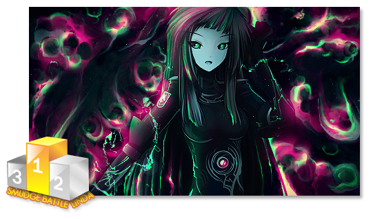
    So here's my first piece since my break
    Colours and brightness looks bad because the computer I do this on is screwed in those departments (not a tech geek so I don't know how to fix it)
    Basically it is meant to be brighter than this :P

    Anyway just made it to get back into the swing of things XD
    As some of you may or may not know I had that rough patch before I stopped as well so I hope you guys like it XD

  2. #2
    Join Date
    Nov 2009
    Location
    Belgium
    Posts
    358

    Default

    What piece?


  3. #3
    Join Date
    Feb 2011
    Posts
    1,325

  4. #4
    Join Date
    May 2010
    Location
    Australia
    Posts
    1,223

    Default

    Quote Originally Posted by Provided View Post
    What piece?
    The house one.. The only one there :P

    Thanks for that again.....

  5. #5
    Join Date
    Jul 2008
    Location
    Leominster, Massachusettes
    Posts
    2,293

  6. #6
    Join Date
    Nov 2009
    Location
    Belgium
    Posts
    358

    Default

    Couldn't see it earlier, probably because I was at school.

    Anyway got to agree with the previous. The blending really needs a lot of work. It feels copy-pasted.


  7. #7
    Join Date
    Mar 2009
    Location
    Latvia
    Posts
    2,381

    Default

    wow wr ;/ how nice off u... i see he needs blending, but maybe give him a tip not a pricky answer.
    The colours are great in my view, but the light needs help.. u need keep things darker witch are the bg, and things u wanna bring out should be lighter but not over lighted, also in same light not one more and one less [ i hope u get my point xD my english isnt way it should be ]
    also try adding depth by blurring things witch are "the background" and darken them a little with burn tool ;]


  8. #8
    Join Date
    May 2010
    Location
    Australia
    Posts
    1,223

    Default

    Thanks so much Linda! <3
    I get what you're trying to say (I think) as in not making one too much obviously brighter than the other but there is still that difference sorta?
    I get the thing with depth easily enough.. Hopefully with some more practice I can get back into the swing of things!
    Thanks <3

    Thanks heaps to Provided!

  9. #9
    Join Date
    Feb 2011
    Posts
    1,325

    Default

    Daw. So sweet.

  10. #10
    Join Date
    May 2010
    Location
    Australia
    Posts
    1,223

    Default

    Dude seriously what is wrong with you?
    I haven't done anything to you so please just gtfo?

Similar Threads

  1. Dr. House Tag
    By Craig1993 in forum Sigs & Manips
    Replies: 5
    Last Post: 10-30-2010, 05:42 PM
  2. Mad House
    By Rho in forum Sigs & Manips
    Replies: 2
    Last Post: 09-20-2010, 06:10 AM
  3. House m.d
    By Gurdev in forum Sigs & Manips
    Replies: 7
    Last Post: 09-05-2010, 08:28 PM
  4. eXx - House
    By excellence in forum Sigs & Manips
    Replies: 15
    Last Post: 08-27-2010, 06:29 PM
  5. Im in the house.....
    By Samuel in forum Introductions
    Replies: 5
    Last Post: 10-24-2006, 08:07 PM

Posting Permissions

  • You may not post new threads
  • You may not post replies
  • You may not post attachments
  • You may not edit your posts
  •  
Powered by vBadvanced CMPS v4.1.1