0 members and 5,611 guests
No Members online

» Site Navigation

» Stats
Members: 35,443
Threads: 103,072
Posts: 826,684
Top Poster: cc.RadillacVIII (7,429)
|
-
-

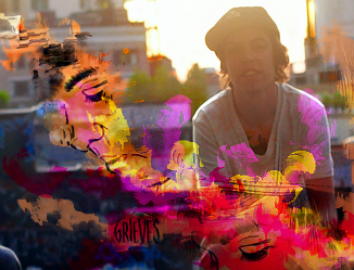
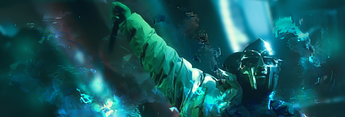
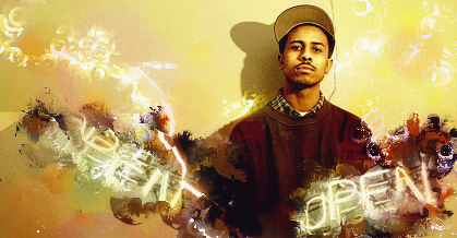
3rd one has the best concept, but I don't like the effect you've used on any of them, they just don't appeal to the eye. First one has way too much contrast.
-
 Originally Posted by JoShO

3rd one has the best concept, but I don't like the effect you've used on any of them, they just don't appeal to the eye. First one has way too much contrast.
agree with this for most part sept i feel 2nd is your better tag not your last i feel the effects go better with that sort of tag but the focal should have been brought up more it looks like he's slipping down on you .
the top one just looks messy and added another tag of yours or someone Else's to get that effect in your tag and erases other parts of it . and set for over lay . keep practicing m8 cya around.
-
i really love the concept man goodjob in those 3 tags
 ^thanks for the epic gift AGITATOR!
-
Cool style, I actually quite like it. But it definitely needs work. I'd try doing more of what you did in #3. Try to work with your colors more since they all seem a bit off. Kiu!
Similar Threads
-
By ascheb in forum Sigs & Manips
Replies: 4
Last Post: 07-11-2011, 03:35 PM
-
By KidBuu in forum Digital Art
Replies: 9
Last Post: 07-01-2009, 11:25 PM
-
By Jefster in forum Digital Art
Replies: 8
Last Post: 07-25-2006, 02:49 PM
-
By Elektrik in forum Digital Art
Replies: 4
Last Post: 04-19-2006, 05:13 PM
-
By NoScorp in forum Digital Art
Replies: 6
Last Post: 01-04-2006, 10:59 PM
 Posting Permissions
- You may not post new threads
- You may not post replies
- You may not post attachments
- You may not edit your posts
-
Forum Rules
|


 Reply With Quote


