0 members and 243 guests
No Members online

» Site Navigation

» Stats

Members: 35,443
Threads: 103,072
Posts: 826,684
Top Poster: cc.RadillacVIII (7,429)
|
-
 Delicious Pink Eye Delicious Pink Eye
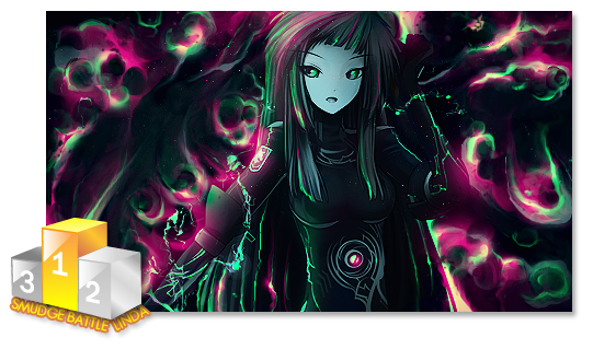
Been busy with life but today I had time to pump out a sig.
I've made alot of sigs and scrapped a lot of them but this is one I'm finally satisfied with.
As always your CnC is very much welcomed.

EDIT 1: I toned down the saturation and brightness and removed the text for now (untill I feel like redoing it).
Also added more blur on a c4d in the background that may have thrown the depth off

Edit 2:Made it a little brighter and add more saturation

Last edited by Roxkis; 11-20-2011 at 08:32 PM.
-

* RUDE REMARK REMOVED BY DM.*
Depth is off.
Colours are a bit bright
Text should NEVER be at an angle like that.
-

 Originally Posted by Lewk

Depth is off.
Colours are a bit bright
Text should NEVER be at an angle like that.
Ouch!
So here's an edit.
I toned down the saturation and brightness and removed the text for now (untill I feel like redoing it).
Also added more blur on a c4d in the background that may have thrown the depth off.

Last edited by Roxkis; 11-20-2011 at 05:45 PM.
-

I liked the saturation in the first version, maybe add some fg fx and tweak the lighting pretty cool mannn gj
Blew the whole shit up on some, "What this button do?"
-

 Originally Posted by Maietrix

I liked the saturation in the first version, maybe add some fg fx and tweak the lighting pretty cool mannn gj
Thank you 
-

Cough*
What lewk should have said is as follows:
You are creating flow, but your depth is off, when you have too much of your effects/bg blurred you are infact passing off just lack of detail minus the focal, you want the focal ofc to catch the eye, but you should as well try to blend in the effects better so as to show her in the placement. Such as only bluring lightly some effects and leaving others that are closer to her in full, or just dabbing areas.
Your have a good collection of colours here but they all seem very high, as if you might have all your effects on line dodge/screen etc. I would suggest either toning them down some or get a new layer on top of your finished product, fill it with gray then take your burn/ dodge tools and on low opacity start giving depth/shadow to special areas such as under her, to the left of her etc.
There is no clear rule to art and or text, but text leading away from the focal will distract the viewers eye and in fact pull the eyes attention away from the most important part, your focal, if having a hard time with text just leave it out, or try and find more natural placement, such as the rule of thirds.
Hope I helped explain some 
Lewk for a CnCer I am disappointed, if going to give such negative feedback be sure to explain why, ppl won't learn if they do not understand how/why something might be wrong/off.
I hope to see better CnC from you in the future.
 Radi's one of a kind gift <3
 ^My Wish List^

-

 Originally Posted by Slave

Cough*
What lewk should have said is as follows:
You are creating flow, but your depth is off, when you have too much of your effects/bg blurred you are infact passing off just lack of detail minus the focal, you want the focal ofc to catch the eye, but you should as well try to blend in the effects better so as to show her in the placement. Such as only bluring lightly some effects and leaving others that are closer to her in full, or just dabbing areas.
Your have a good collection of colours here but they all seem very high, as if you might have all your effects on line dodge/screen etc. I would suggest either toning them down some or get a new layer on top of your finished product, fill it with gray then take your burn/ dodge tools and on low opacity start giving depth/shadow to special areas such as under her, to the left of her etc.
There is no clear rule to art and or text, but text leading away from the focal will distract the viewers eye and in fact pull the eyes attention away from the most important part, your focal, if having a hard time with text just leave it out, or try and find more natural placement, such as the rule of thirds.
Hope I helped explain some 
Lewk for a CnCer I am disappointed, if going to give such negative feedback be sure to explain why, ppl won't learn if they do not understand how/why something might be wrong/off.
I hope to see better CnC from you in the future.
OMG! Thank you very much! Your post was supremely helpful! Will post back with an edit later!
-

Well..I am just going to shake my head and go do what needs to be done.
Roxkis, I apologize for that.
 Thanks.
Prick.
-

That's pretty, i actually like the colours, and well i love render u used. ;]
U over blurred the efects, u should keep some off them clean, and blurr the ones, that should be in background, as in creating depth.
dont use that text, better put it close to focal but horizontal, it's best way for text, trust me!
The light u put on her head is bit wrong, look at the render, she has her light on her face, so put it at bottom of sig ;]
Also use dodge and burn tool. Burn around the render where u want it to be background [ depth ] and dodge for light on the render and effects ;]
trust me, ur going right way!
best of luck!
-

Apologies for my somewhat harsh criticism..
What I should have said was.
Your background is too blurry in comparison to your foreground this gives a false sense of extreme depth which isnt neccessary and kills the composition.
The colours were too bright for my liking because they are very garish and I personally dont like overly saturated pieces. They strain my eyes and its hard to see something to make it stand out.
The text was at a horrid angle though. It was hard to read and killed the flow of the piece.
Similar Threads
-
By BeaSt in forum Digital Art
Replies: 1
Last Post: 09-04-2007, 01:57 AM
-
By Xobile in forum Sigs & Manips
Replies: 4
Last Post: 04-15-2006, 07:12 AM
-
By Chucks in forum Sigs & Manips
Replies: 18
Last Post: 12-21-2005, 08:15 AM
-
By Tw1tcH in forum Digital Art
Replies: 5
Last Post: 07-17-2005, 07:50 AM
Tags for this Thread
 Posting Permissions
- You may not post new threads
- You may not post replies
- You may not post attachments
- You may not edit your posts
-
Forum Rules
|


 Reply With Quote


